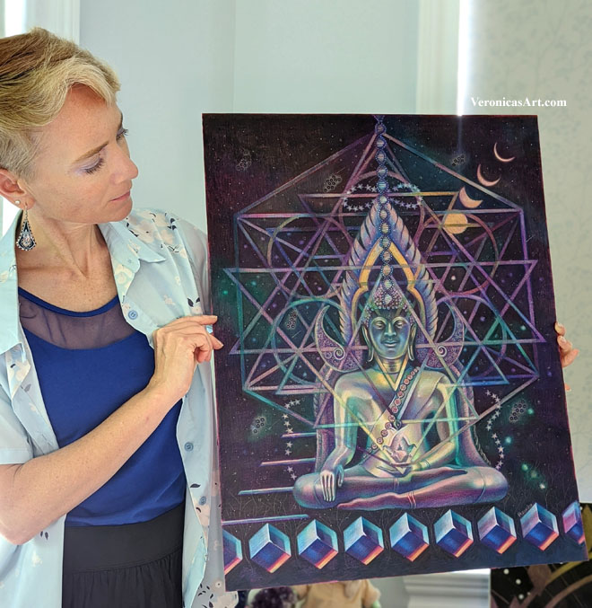
When you begin drawing in colored pencil, the aim is to copy what you see in front of you or in your reference. Artists who draw in colored pencil pay attention to small things like details and textures, and they’re important. However they become important only when the basic drawing is in place. If you begin shading one spot and forget about the rest of your composition, you might end up having the drawing that has no consistency or unity in color.
1. Consider big picture first drawing in colored pencil
Decide on the overall theme for your drawing. Is it light or dark? Is it monochromatic or in full color? How do you decide? Look at your main reference to see the dominant color. Make that particular color your main focus. Everything else should be less color intense.
2. Test your colors
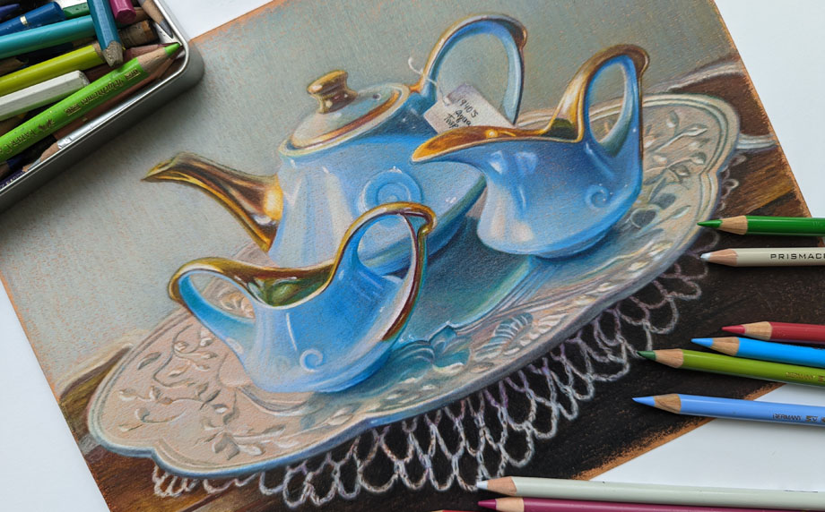
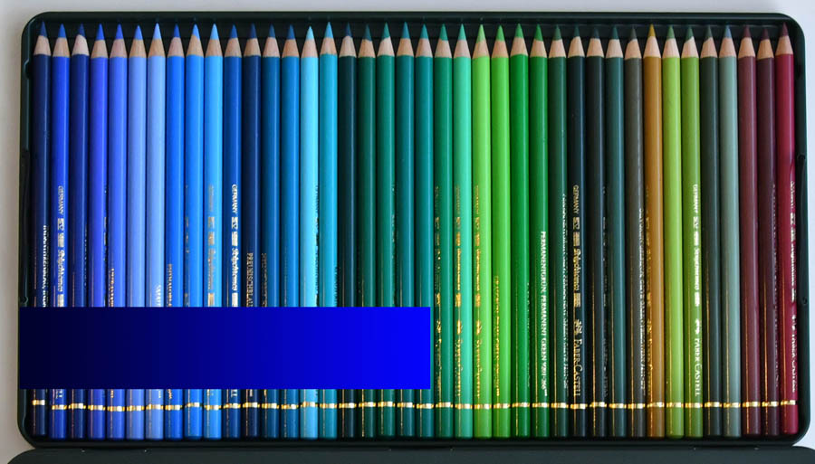
Test your colored pencils on the paper you’re going to draw on. If you see lots of blue in your reference, test all your blues to see which ones look similar to your picture. Start testing these colors right next to your reference and you’ll see that some colors are totally off and don’t belong as your main hue. There are many similar colors that you don’t have to use. You can adjust your pencil pressure drawing in one blue to get a range of blue tones (or values).
3. Keep it simple
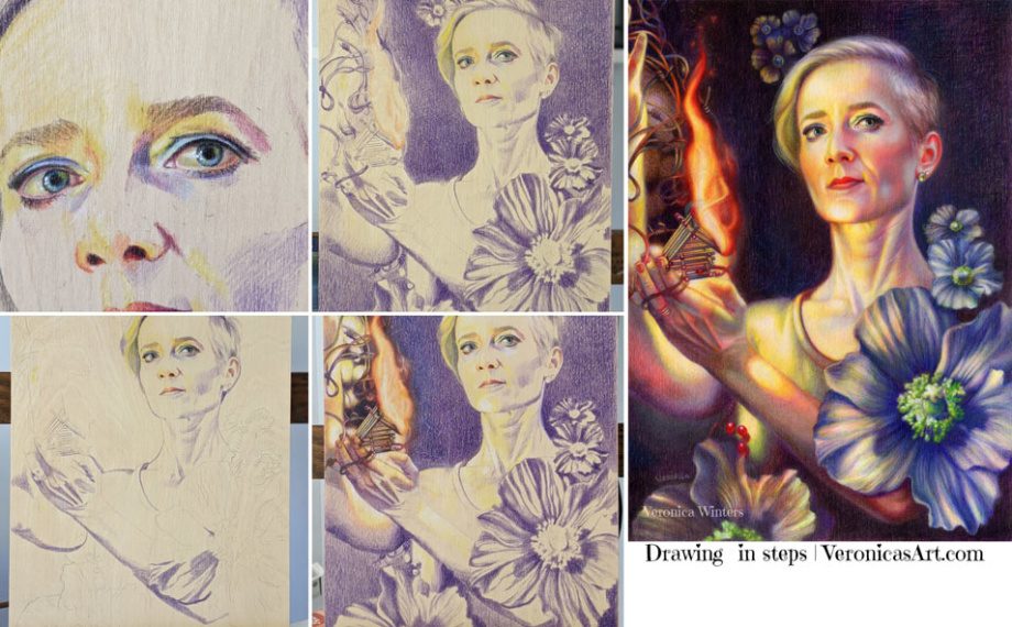
Draw the shadows in one color first. Mark the highlights. Students love to jump in using all possible colored pencils to draw one thing. Instead, pick one color to develop all your shadows first.
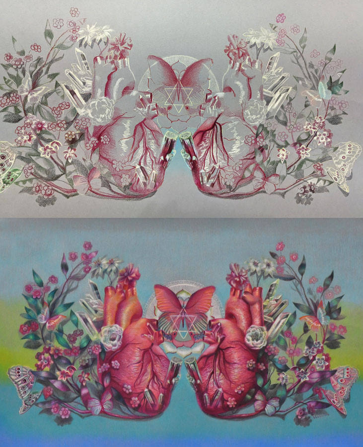
4. Add more tested colors to develop contrast or range of tones
Most colors are warm and cool. This includes reds, greens, blues and even greys. Some are neutral like browns. You also must consider how light or dark they’re. You can’t create a very dark shadow using light pink. You can’t shade around the highlight with a deep blue.
Develop contrast by having a range of tones in your drawing going from very light colors to very dark ones. Of course, not all references call for it but keep it as a guideline for your art.

5. Look at your drawing from the distance!
You lose all the details by looking at your art from the distance. You do see the inconsistencies in color, awkward shapes, weak shadows and highlights, or undefined edges.
If you consider all 5 rules you will be able to draw a photorealistic colored pencil drawing that has unity in color.

Some basic definitions:
- Hue – means color. Red, green, yellow, etc.
- Value – means how light or dark the shading is.
- Chroma – is the color’s strength or color intensity. Colors can be super intense or muted.
You can learn a lot more about color by taking my video course where I explain the properties of color and how you can design your images around color. I share my secret picking a perfect color scheme for my paintings every time.

https://veronica-winters-art-school.teachable.com/p/color-crush-course-for-colored-pencil-artist-by-veronica-winters


:strip_icc()/BHG_PTSN19720-33d9cd22f6ab49e6a21982e451321898.jpg)

More Stories
BSA Film Friday: 11.25.22 | Brooklyn Street Art
FEATURES – Art in VR with Casey Koyczan
Julie Karpodini: Painting Instinct – Jackson’s Art Blog