#1 What’s your idea in colored pencil drawing?
Have a general idea in mind what colored pencil drawing you want to create. The idea is a visual story in color, subject or light. It doesn’t have to be the figure. It could be one object displayed in a unique light, rotation or point of view in artist drawing. This is the artistic vision and interpretation of a “boring” object that becomes fun to look at because of your unique interpretation of it. You can train yourself to see the world more creatively by improving your photography but also reading, looking at art masterpieces and other contemporary artists’ work.
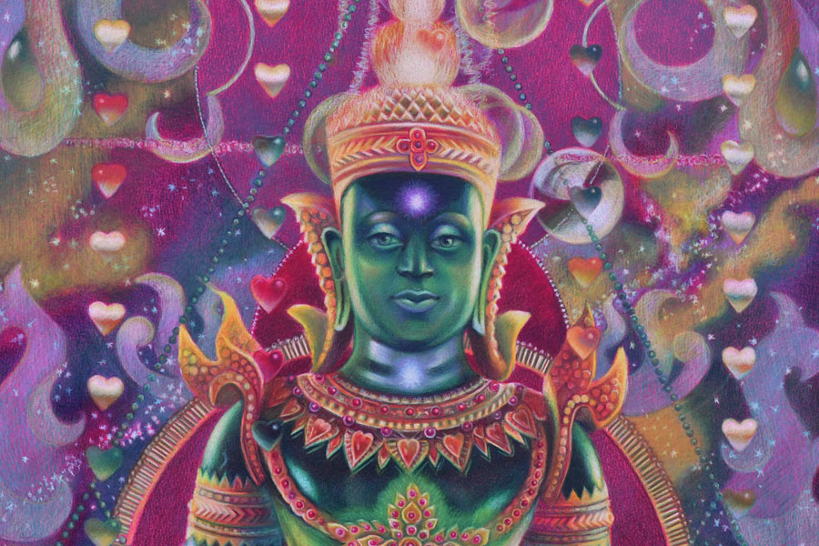
My idea starts from my imagination, reading and thoughts. I imagined a seated figure with light passing through the entire body. I also imagined a rain of hearts above the figure. I made notes on my phone…I wanted to depict energy, chakras and the colors of the Universe in this colored pencil drawing of Buddha. I came home and started thinking of my references to illustrate this idea.
#2 How good are your references for colored pencil drawing?
At first I wanted to paint a person but I had no references of the pose and asking somebody to pose could be a drag too. So I went back to my folder with my trip to Thailand a decade ago. I saw so many beautiful Buddhas and palaces there…And this green Buddha was made out of semitransparent stone that looked almost like glass.
You need to pay attention where your references come from. Sometimes you can’t enter competitions drawing from someone else’s photo. Other times, you don’t have an emotional connection to the picture which is not yours. Or you need to get a photo release and it takes time. Personally I try to use my references but when it’s impossible to do, I go to Pixabay to find inspiration and you can too! Pictures are of high-quality and free for commercial use. The only problem with them is that they’re Photoshoped heavily and you’ve got to pay attention if the chosen picture has both warm and cool colors to draw from.
Picking the right references is not enough. They need to “connect” with each other- have similar light source and color temperature.
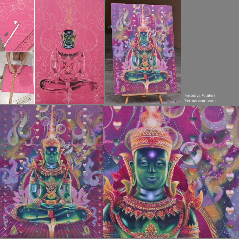
After that think of your design. I always design my images around the largest or main subject. Place it first and create smaller shapes around it. The largest shape is Buddha’s image. I used the ruler to mark straight lines as a guide to place the hearts over them. I cut a heart-shaped template to trace it throughout my colored pencil drawing. The planning stage is a long and thoughtful process for me because I want to have the exact image in place before committing to shading it for a month. That’s why I use Photoshop to plan the design as much as possible by layering and moving elements around the main figure.
#3 What’s your main color scheme in colored pencil drawing?
This drawing has quite sophisticated color scheme. I usually focus on having just 1-2 dominant colors in each drawing but this one goes beyond the basics. Mine is a combination of cool red, green and cool, off-white (colorful, bluish lights).
My tip is to focus on having just 1-2 main colors in your drawing. It doesn’t mean that you use just two colored pencils for that. It means that you pick the basic scheme, say, ‘yellow-purple’ and design your colored pencil drawing in these colors. The rest of them should be grayed down or become less prominent to support the main hues.
#4 How to pick colored paper for your specific color scheme
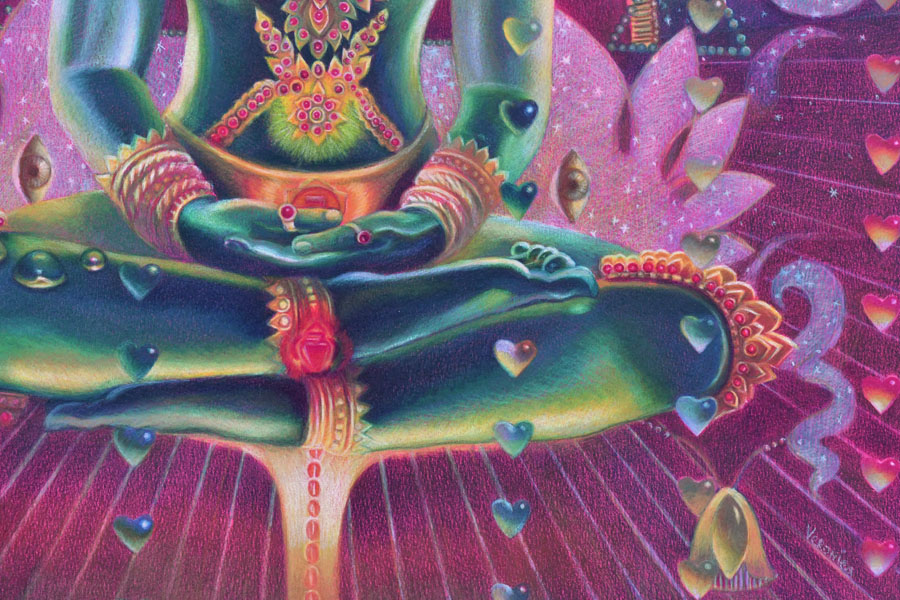
I love drawing on Canson Colorline paper because it comes in a variety of bright colors. The texture is not overwhelming and colored pencils become very vibrant drawing on such paper. (I’m linking to this paper on Amazon but I find that DickBlick sells a variety of colors).
Once you picked you main color scheme, say ‘yellow-purple’, look at the color of your drawing paper. And if confused test a few of these colored pencils on it to see how vibrant or dull they’re. Some colors may disappear on colored paper and others would be super bright. In general, don’t draw on yellow colored paper if your main color is ‘yellow’. Don’t draw on a purple drawing paper if your main color is ‘purple’. Pick the opposite color of paper (like green or orange) and test the colored pencils on it.
#5 Is your shading consistent in colored pencil drawing?
Always start shading from your darks. Don’t jump around with colors. Pick one color and shade all the darks with it. Mark the highlights with white colored pencil (or reserve the space for your highlights if you draw on white paper). Lastly, shade the middle tones connecting the darks with the lights.
Shade with the softest colored pencils, filling in large areas. If you start working with harder colored pencils like Polychromos, it might be frustrating to fill in large space. I save a lot of time and hustle for myself by drawing with the softest pencils first like Prismacolor Premier and Luminance or Pablos, and then switching to harder pencils like Polychromos to work on the details in my colored pencil drawing.
Have fun creating your super vibrant colored pencil drawings!
If you have any questions or want to connect on social media:
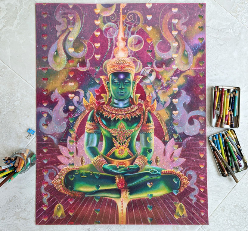
Approx. size 19×25 inches, artist drawing on Canson Colorline drawing paper, lightfast colored pencils ( Faber-Castell Polychromos, Luminance and Prismacolor Premier colored pencils)



:strip_icc()/BHG_PTSN19720-33d9cd22f6ab49e6a21982e451321898.jpg)

More Stories
BSA Film Friday: 11.25.22 | Brooklyn Street Art
FEATURES – Art in VR with Casey Koyczan
Julie Karpodini: Painting Instinct – Jackson’s Art Blog