

Coloured pencils are a match made in heaven for botanical subjects, precision and detail. They are portable, forgiving and accessible and by using layering techniques they offer you the ability to create and reproduce vibrant pure colours on the page which are a joy to behold. As the seasons change and the cooler months make their way to our doorsteps, what can be nicer than filling our artistic world with the colour and pizazz of wonderful botanical art. In this article I will share with you some tricks of the trade using Derwent’s Procolour pencils and how to create the perfect green.
The pencil ideal for fine detail
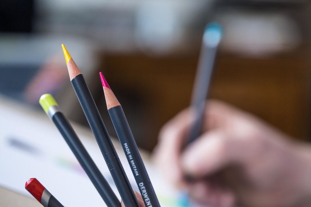
Procolour pencils are part of Derwent’s professional range, and offer coloured pencil artists’ the perfect combination of a strong point and smooth laydown. They combine the best of the Artists’ and Coloursoft ranges. Highly pigmented Procolour have a texture that applies smoothly like an oil-based pencil but with the covering power of wax. Their durable, sharp point allows for drawing even the finest of detail with lasting precision. Whilst minimal dusting means that your work will remain clean and smudge-free. These pencils can also achieve beautiful blended results with a range of accessories and mediums, including Derwent Blender Pens and Derwent Paper Stumps.
Texture, tone, colour and shape
Nature is always moving, flowing and evolving. It offers a wealth of wonderful subjects from the very bold, structural, singular, architectural and colourful, all the way through to tiny composite organisms such as lichen and microscopic algae. All subjects have their intricacies with their very own secrets to unlock and explore.
Simplify the shape
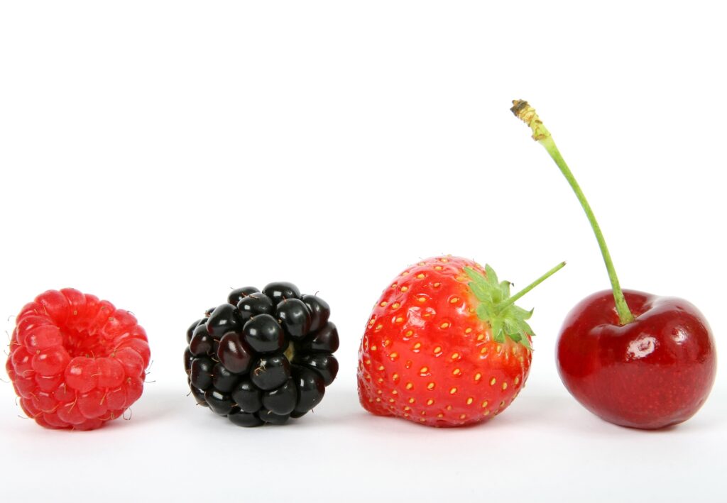
To express the shape and form of flowers, fruit, grasses or foliage in botanical drawings, look at the image and break it down into its basic geometric forms. A sphere, cup, cone or tube. Each element will have highlights (reflections from the light) and shadows (where the light can’t reach).
Identify the tones
Always use at least three tones of the same colour pencil and aim for a smooth transition and graduation of tone between them. This is particularly important on smooth surfaces, spherical surfaces & water droplets too! Before you begin, identify those lightest areas and be mindful to reserve them. If the surface of your subject is very shiny the highlight will be particularly bright. So you may consider leaving the white of the paper for this. Remember ….It’s always easier to go darker than lighter! However, if you do end up loosing your lightest highlight, it’s not necessarily correct, but a cheeky touch of a white paint pen or white gouache does wonders to restore them.
If you are unsure of your tones try squinting at your subject. This should blur out all the detail and make it easier to identify those lights and darks. Or you could simply convert a photo of your subject to black and white (or greyscale). Then you have just the tonal values in front of you with no confusions of colour.
Squint at your subject and identify the overall shape and where the light is coming from. Look closely at the colour and where the highlights and shadows fall. Now choose your main base colour from your pencils that is the closest to that colour. Select two or more shades of that colour ensuring that some are lighter and darker than your base colour.
Top tips on creating botanical greens
If you’re interested in botanical art then you will be hard pushed to avoid using the colour green! Green is one of those Marmite colours! You either love it or loath it and it can look very flat and uninspiring (particularly with coloured pencils)… but here’s the secret … to create a believable and interesting green, one green is never enough!
Tip 1 – Mix your greens
Always use at least three greens mixed together, supplemented with other colours to adapt the mix and tone to add depth. It’s all about those layers. Warm up greens by applying yellow-greens or yellows over the top. Darken greens by adding a touch of red, purple or dark blue. Remember all greens are typically made with different varieties of yellow and blue pigments. So if you find your coloured pencil supply is lacking certain colours, experiment with optical mixing and use this to your advantage.
Tip 2 – Create a colour chart
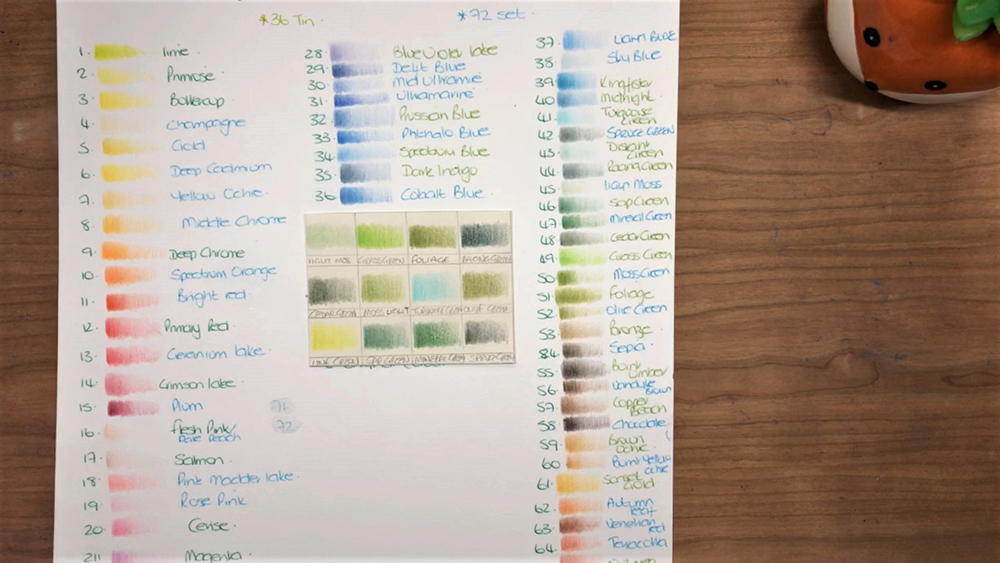
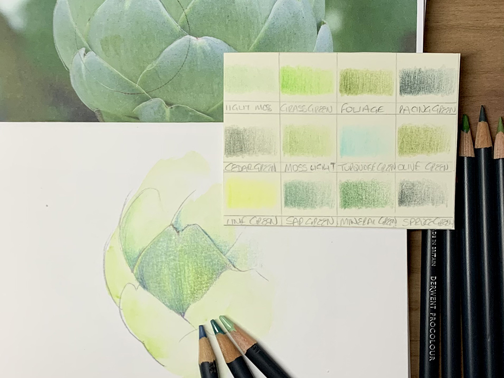
Don’t be beguiled by the names used for pencils (I’m such a sucker for a good name). You often see names such as grass green, moss green, cedar green etc. Used independently they often look very garish and artificial. The colour of the barrel or lead rarely matches the colour they lay down to! So always create a colour chart with any set of new pencils. They make an essential reference point and allow you to match the colour to your subject rather than the name.
Tip 3 – Practice matching colours
A great way to practice your optical mixing is to pick up some paint swatch cards from your local hardware shop. Spend time trying to create that exact shade/tone/colour in your sketch book by layering, blending and correcting colours with your pencils until they match. You’ll find the more you practice the quicker and more confident you will get. You will also find that you begin to favour certain pencils and blends as your style develops.
Tip 4 – Break down the subject
Sketch book work and exploring colour combinations are invaluable practice for botanical art. Fully rendered pieces of work can take many hours of careful layering, colour matching and creating. With this in mind, it’s good practice to break down the subject into smaller parts (leaves, flowers, colour, shape etc). Experiment and do your homework before you begin. This saves a lot of heartache and frustration and it’s a great reference for similar subjects in the future.
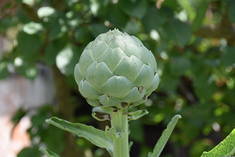
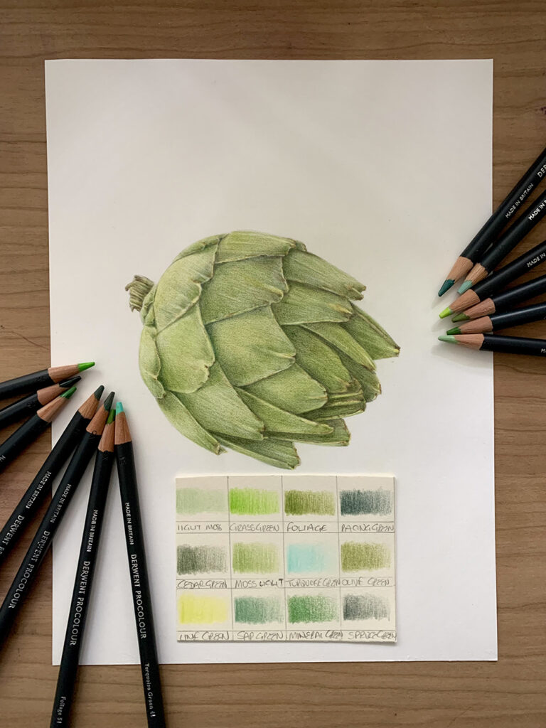
For instance, an Artichoke is a complex object to draw. Consider its shape, main colours, texture and form. Spend time exploring these complexities in your sketchbook will give you an understanding and a new found confidence in approaching a fully rendered drawing.
Try rendering a small section of an artichoke in your sketch book. Look at the combinations of greens, complimentary colours, tone and shade you could use to create the texture and form of what you see.
Tip 5 – Use a wash
I often use a wash under my pencil work to unify and lift the background. Inktense pencils work wonderfully as they are bright, transparent, and once the ink dries it remains permanent. In the image above I’ve used a light wash of Apple Green as a base layer. Other artists use watercolours or some form of solvent such as Zest It Pencil Blend to break down and blend the first layer. Practice on your paper to be sure it’s capable of such processes. If you can draw a section of the subject then you can draw the full thing. It’s just a case of replicating what you have learnt on a larger scale.
Tip 6 – Paper is key
A cheap paper will often give poor results and set you up for a fail. Instead, opt for good quality smooth ‘high white’ paper either as a sketch book, loose leaf or Bristol board. Hot Pressed watercolour paper is fun to use too. An under layer of inktense or watercolours can be applied to hot press paper to intensify colours.
Tip 7 – Be diligent
Keep your pencil points sharp and your marks light and constant. Irregular marks can be really tricky and sometimes near impossible to cover up in subsequent layers due to the transparency of the pencil pigments. This can be used to your advantage too!
Tip 8 – Make your pencils work for you
Spend time getting to know the capabilities and limitations of your brand. Invest time in learning how to optically mix your colours on the page. Be bold with your colour choice and use complementary colours to really make your work sing. But above all, experiment, enjoy the process, and do what makes you happy.
Tip 9 – Creating Darks
Creating punchy and vibrant darks can be tricky with coloured pencils. Complementary colours are a fabulous way to create depth and interest in your darks. Particularly beneficial if you don’t have a great selection of greys in your set. Many botanical artists will create a fully rendered grey toned underpainting of the subject. Colours are then layered over the top to give the drawing an added dimension of form.
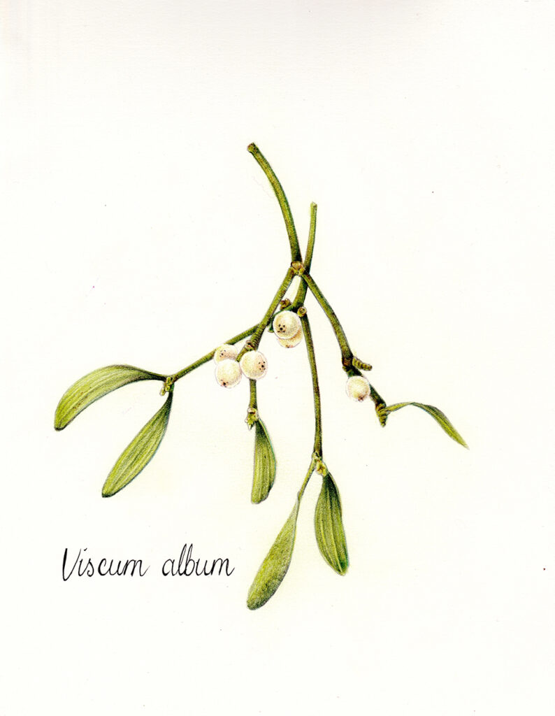
I hope you’ve enjoyed these hints and tips, and are now feeling inspired and well on your way to creating some beautiful botanical pieces in pencils. If you have had a go at the exercises above (greens and spheres) you will have all the skills to be able to draw a bunch of beautiful Mistletoe with cute little berries … just in time for the twinkly season!
You might find some of our other blog posts helpful for choosing the right coloured pencil and further information on Derwent’s pencil range.
Biography
Cherry Ferris is a self taught artist who is fascinated with colour, pigment, materials and all things sparkly. She is particularly drawn to nature and the beautiful creatures that inhabit our planet and she’s potty about hares, foxes and owls which is why they seem to pop up in so many pieces of her work. She likes to use many types of media and is versed in pyrography, acrylics, coloured pencils, watercolours and pastels. Cherry also loves the heightened detail in botanical illustration and often uses these techniques alongside many others elements and fusing them together within a piece of artwork to create something exciting and new.
Cherry’s work has been shown in Wildwood Gallery on Dartmoor, the Derwent Pencil Museum at Keswick, The Wildlife Art Society International (TWASI), Powderham Castle, The South West Academy Fine & Applied Art Open Exhibition (SWAc) & at OXO Tower, London with the Explorers Against Extinction. She is also published in numerous national and international magazines and is a contributing artist to the Earth Pathways diaries & calendars.
Cherry also runs workshops for beginners to more advanced artists and also enjoys creating inspirational & innovative community projects to bring people together from all walks of life to unite and create beautiful art.
Cherry lives in Sidmouth, Devon, UK. Email her at [email protected] or visit her website www.fairiewoodart.com or follow her on Instagram https://www.instagram.com/fairiewood_art/

:strip_icc()/BHG_PTSN19720-33d9cd22f6ab49e6a21982e451321898.jpg "Fresh and Airy Interior Design Living Room Ideas for Summer")


More Stories
Mapping Eastern Europe Website Launched
Kengo Kuma Designs a Dramatically Vaulted Cafe to Evoke Japan’s Sloping Tottori Sand Dunes — Colossal
Keeping The Artist Alive | Chris Locke | Episode 888