

Botanical painter and watercolour tutor Sandrine Maugy tests Jackson’s Curated Set for Vegan Watercolour.
Sandrine Maugy Tests Jackson’s Curated Sets: Vegan Watercolour
First I have to say that I was thrilled for Jackson’s to curate a vegan watercolour set. Finding information on art materials and whether or not they are truly vegan can be difficult. Here Jackson’s did that work for us, and we can open the box and use the materials with confidence and peace of mind.
The set contains:
- Jackson’s Kite Synthetic Kolinsky Brush Round No. 1
- Jackson’s: Icon: Synthetic Sable: Watercolour Brush Quill No. 0
- Stonehenge Aqua Watercolour Paper Block, 140 lb/300 gsm, 7 x 10 in, Cold Pressed/Not
- Etchr Mini Palette 19 wells
- Daniel Smith Watercolour Paint 5 ml Set of 12 Jackson’s Selection Colours: Hansa Yellow Light, Pyrrole Orange, Alizarin Crimson, Rose of Ultramarine, Phthalo Blue Green Shade, Undersea Green, Raw Umber, Neutral Tint, New Gamboge, Ultramarine Blue, Deep Scarlet, Cascade Green
- Jackson’s Paper Guide
The box itself looks understated and classy: a black box with ‘Jackson’s’ embossed on the lid. Inside, wrapped and protected in monochrome tissue paper, I found the following: A Stonehenge Aqua Watercolour Cold Pressed Paper Block 300 gsm, a tin Daniel Smith Watercolour Paint 5 ml Set of 12 Jackson’s Selection Colours, a round tin containing a two-tier Porcelain Palette by Etchr and two Jackson’s Watercolour Brushes: Jackson’s: Icon: Synthetic Sable: Watercolour Brush Quill and Jackson’s Kite Synthetic Kolinsky Brush. This is everything you need to start painting right away.
Shop Jackson’s Curated Sets: Vegan Watercolour
The best way to test art materials is to paint a picture. But first, I want to paint a colour chart, as I am not familiar with all the colours in the set. The twelve colours fall into three categories: The ones I know already, use regularly, and trust; the one I know already and wouldn’t use; the ones I didn’t know before this review and am eager to try.
In the first category we have Hansa Yellow Light (green bias yellow that has a secure position in my paintbox), Pyrrol Orange (single-pigment red bias orange), Rose of Ultramarine (interesting granulating purple that separates on the paper), Ultramarine Blue (gorgeous violet bias blue), Phthalo Blue (Green Shade) (saturated green bias blue) and Raw Umber (reliable basic brown that can be altered with other colours to create a whole range of neutral colours). The colour I know and wouldn’t use is Alizarin Crimson: this is the original Alizarin, a fugitive pigment that could easily be replaced with a more lightfast alternative, such as Carmine. The third and most exciting category for me contains the colours I have never used before: New Gamboge, Deep Scarlet, Cascade Green, Undersea Green and Neutral Tint. The colour chart is painted on the Stonehenge Paper, using the brushes provided in the set, in order to get a feel for the materials before launching into a full-blown painting.
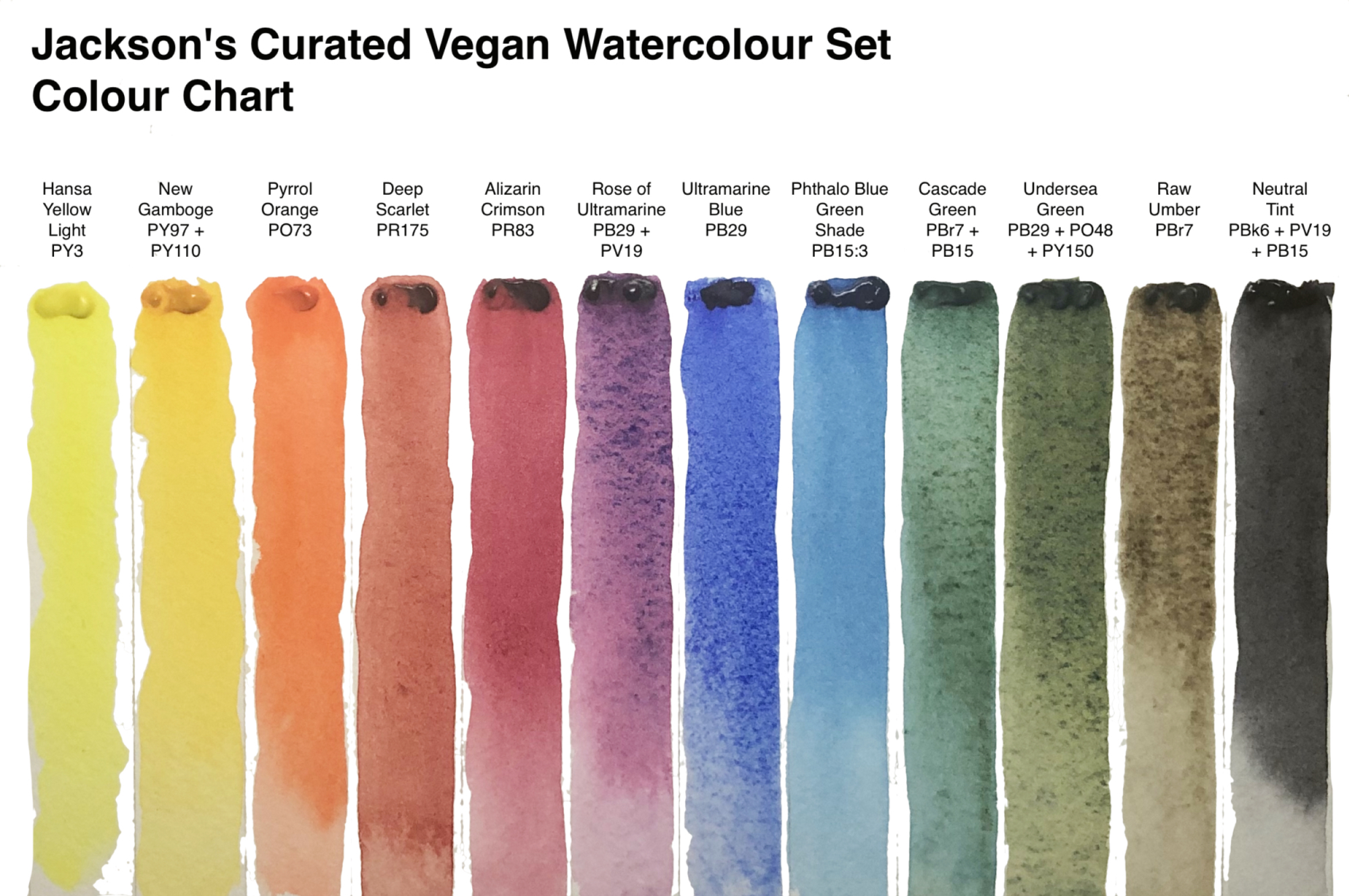
My first thoughts about the colour selection is that it contains some interesting, textured paints but lacks a bright primary red and a pink. That might be the botanical artist in me: I can’t paint without a pink. It might not be so important for a landscape painter. It is also true of the greens. Both are heavily textured and I would need a smoother, more saturated green, which is easily mixed from the two yellows and two blues contained in the set. Pink however, cannot be mixed. My recommendation would be Daniel Smith Quinacridone Pink, a single pigment, saturated, non-granulating and lightfast pink.
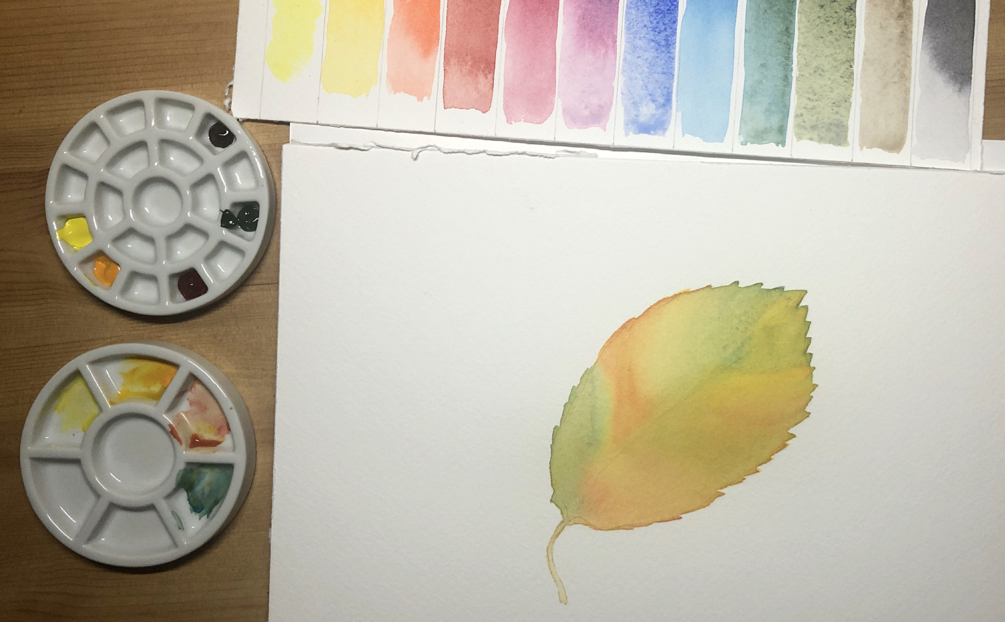
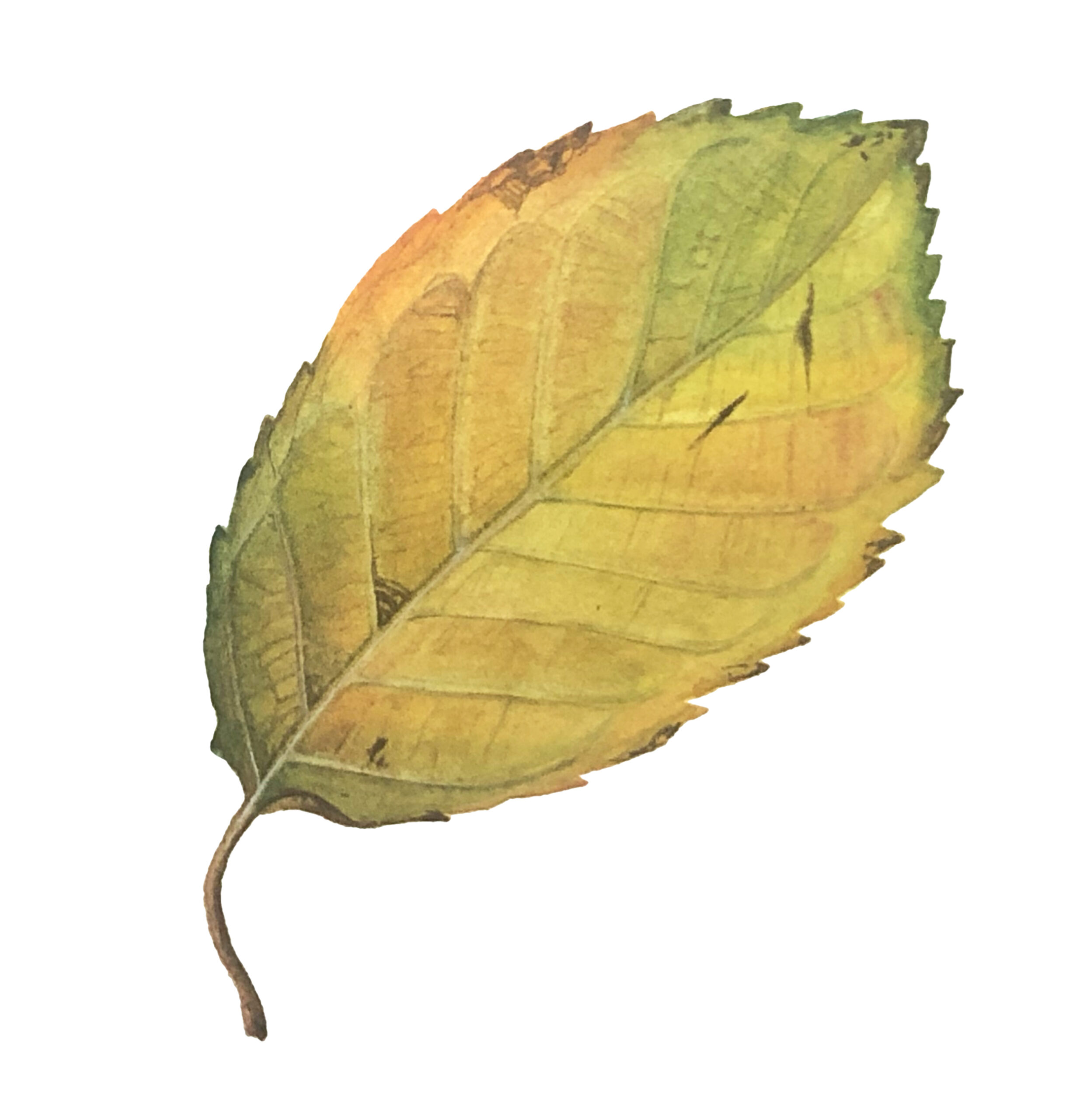
Now let’s paint something. I am keen to try the colours I am not familiar with, so an autumn leaf with yellow, red and green is a perfect subject. The first wash is painted wet-on-wet, covering the leaf with pure water and then adding In Hansa Yellow Light all over. While this is still wet, I drop in some New Gamboge and Cascade Green in different areas, before floating in some Deep Scarlet in the reddest parts. All the colours are merging on the paper seamlessly. The quill brush carries a good amount of paint and tapers to a perfect point. The Stonehenge Paper is relishing the wet work, staying wet long enough for me to add all the colours.
The second wash is painted in the same way, to strengthen the colours. The brush is soft enough and the paper absorbent enough that the first wash does not lift when I apply the second one. I always work in layers, so these qualities are important for my technique to work.
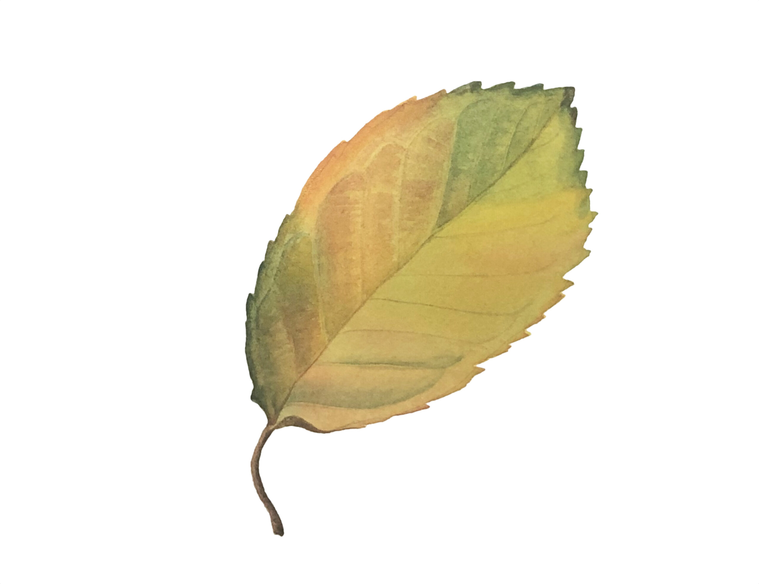
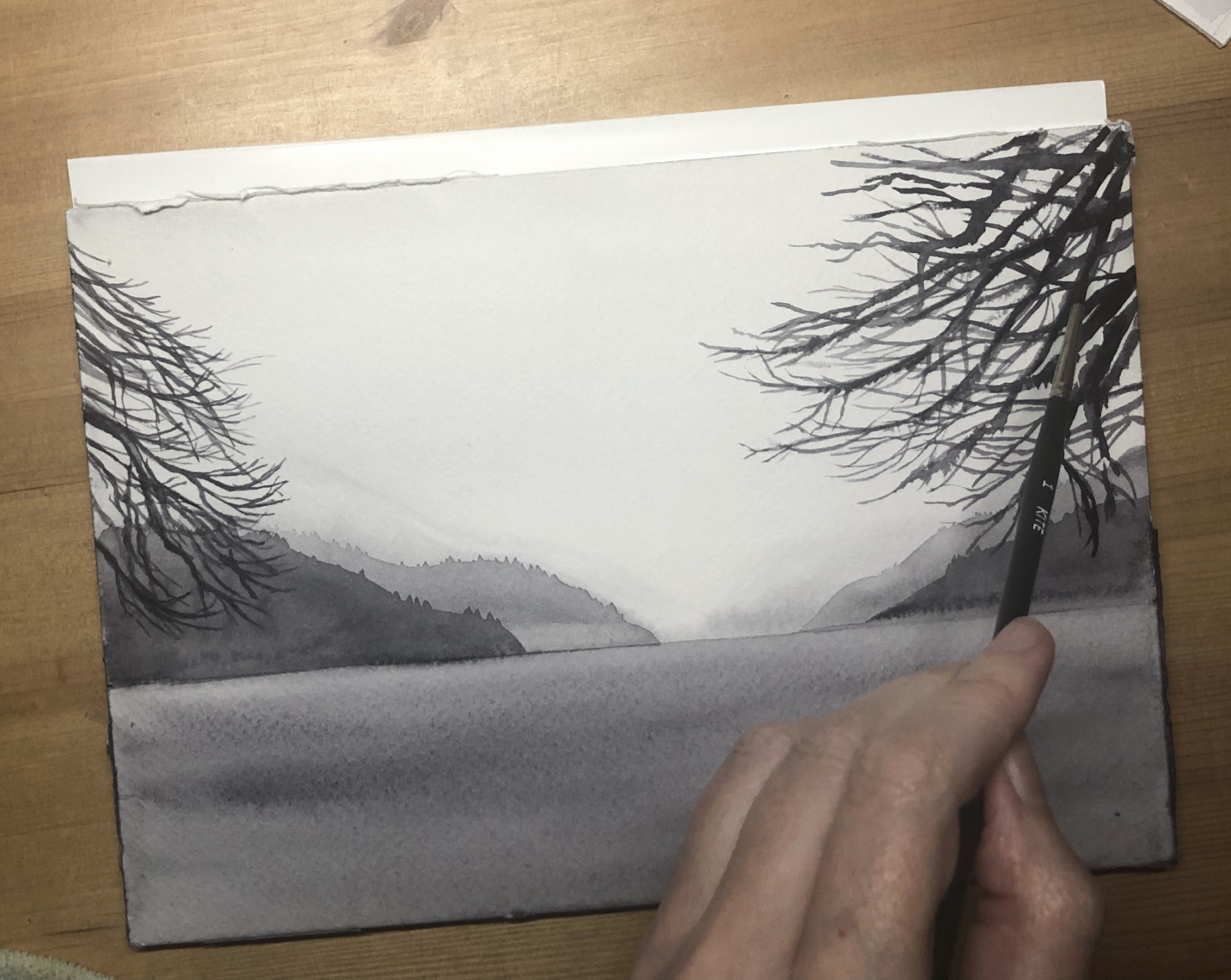
After this second wash has dried, the colours are intense enough to start building up some details with a dry brush. I am switching to the smaller Kite brush, which has a good spring and a fine point. The whole process works beautifully, although perhaps I would have liked a brighter red for the blush on the leaf.
I am intrigued by the Neutral Tint paint, as I never use black pigments in my work. I also would like to test the paper and brushes with larger washes, to see how they fare with a huge amount of water. For this I am painting a landscape for which I need to wet the whole page at once. This is one of my favourite views in the world: sitting on the beach on the Abbey grounds in Fort Augustus, looking over Loch Ness to the North towards Inverness. On a misty winter day the whole landscape is monochrome, perfect for a Neutral Tint trial.
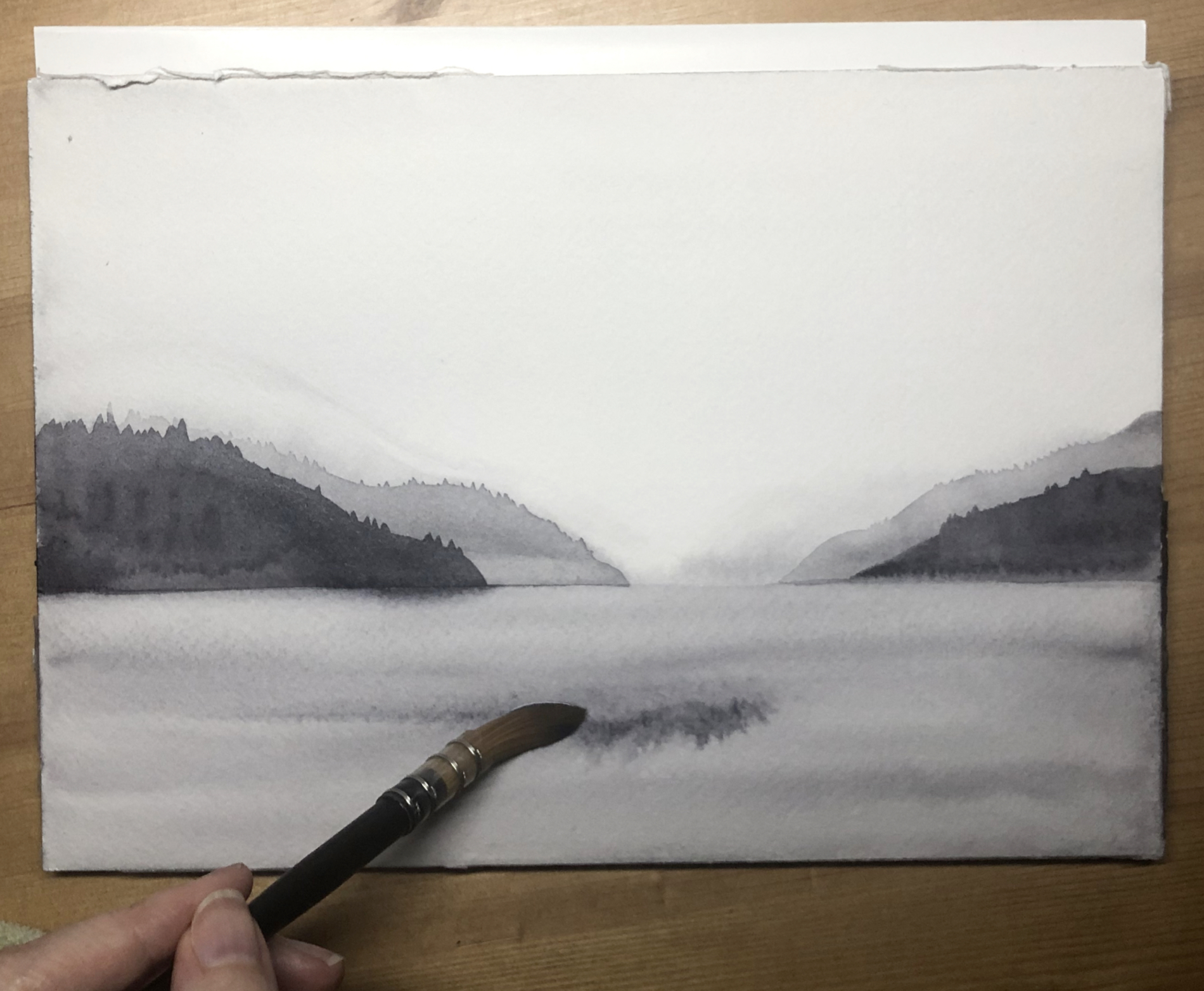
First I paint the sky and sea with a very diluted wash added wet-on-wet. Then come the furthest mountains, painted while the sky is still wet. I add each layer of mountains, working my way towards the foreground, with a less diluted wash each time. The trees are added on dry paper, with an intense, less watery version of the same Neutral Tint. The paper takes the drenching gracefully, with no sign of buckling. The quill brush carries enough water and pigment to allow me to work quickly, before the water has a chance to dry. When diluted, Neutral Tint washes smoothly in a true neutral colour, with just the slightest blue undertone. It looks surprisingly luminous and clean for a black pigment. When used undiluted, it handles like ink. Perhaps I need to review my stern position against black pigments.
In conclusion I would say that this is a very good set and I have no hesitation in recommending it. The Daniel Smith paints are excellent quality, although for me there is a lack of pink and bright red in the selection. This would easily be remedied by buying a Quinacridone Pink and Pyrrol Red.
The Stonehenge paper is resistant to buckling and managed both wet and dry work beautifully. The Jackson’s synthetic brushes performed very well and the little Etchr palette is small enough to be lightweight but gave me enough mixing space for the scale of the paper block.
Watch Sandrine’s Review:
About Sandrine Maugy
Sandrine Maugy is a member of the Society of Botanical Artists, the Association of Illustrators, and the French Society of Botanical Illustration. She was awarded a Silver Medal by the Royal Horticultural Society. Her work hangs in collections in Europe, Australia, and the United States. Sandrine teaches residential courses at the renowned West Dean College, and runs an art blog, and YouTube and Patreon painting channels, with students from all over the world. Her painting style captures the pure, vibrant colours of nature and is infused with dramatic light, giving this traditional style a contemporary twist.
Further Reading
Botanical Painters Share Their Thoughts on Stonehenge Aqua Hotpress
The Vegan Watercolourist: Sandrine Maugy
Vegan Art Supplies
A Guide to Watercolour Painting
Shop Jackson’s Curated Sets: Vegan Watercolour on jacksonsart.com
Read more reviews of Jackson’s Curated Sets

:strip_icc()/BHG_PTSN19720-33d9cd22f6ab49e6a21982e451321898.jpg "Fresh and Airy Interior Design Living Room Ideas for Summer")


More Stories
Fresh and Airy Interior Design Living Room Ideas for Summer
Where Art and Sound Converge: Exploring Fine Art Photography and Music Artist Portraiture
Cooking Chinese Cuisine with Ease Using Jackery Solar Generator 5000 Plus