Jackson’s Curated Sets are made up of high quality materials, carefully selected by experienced artists, beautifully boxed and wrapped in hand painted paper, and ready to be gifted. Here, the artists Julia Trickey, Kit Boyd and Ruth Murray tested the Botanical Watercolour Set, Lino Printmaking Set and the Oil Painting Set, and shared their thoughts and experiences.
Julia Trickey Tests Jackson’s Curated Sets: Botanical Watercolour
Having been an artist and tutor of botanical art for over 20 years, I have become very comfortable with the materials that I use. So when Jackson’s approached me to try their Botanical Art Curated Set, I saw this as an opportunity to put myself in the place of my students trying out equipment for the first time, as well as a chance to explore different watercolour hues, paper and brushes.
The set contains:
- Jackson’s Kite Synthetic Kolinsky Brush Round No. 8
- Jackson’s Raven Synthetic Brush Mop No. 2
- St Cuthberts Mill Botanical Ultra Smooth Glued Watercolour Pad A4 300 gsm
- Isaro Watercolour Paint 7 ml Set 10 Jackson’s Selection Colours: Isaro Yellow Light, Scarlet Red, Ultramarine Blue, Pthalo Blue, Yellow Ochre, Venetian Red, Burnt Sienna, Isaro Pink, Payne’s Grey, Orange Oxide
- Jackson’s Paper Guide
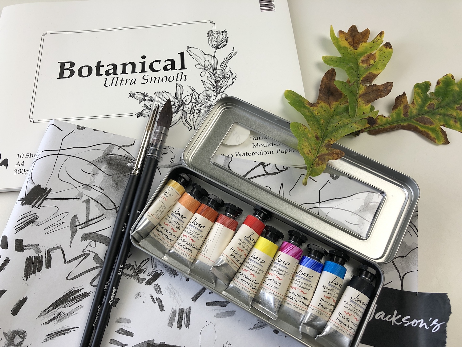
Jackson’s Curated Sets: Botanical Watercolour
The set arrived beautifully packaged and I was pleased to see that the Isaro paints were tubes rather than pans, as I personally can get much richer hues quickly with tube paint. The transparent lid of the paint tin means that you can see at a glance what colours are included and the labels accurately reflect the colour of the paints (not always the case!).
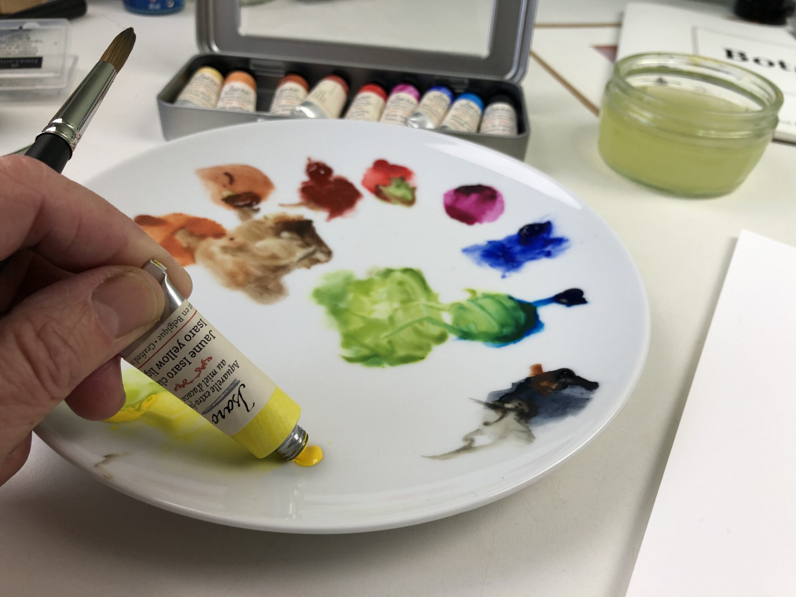
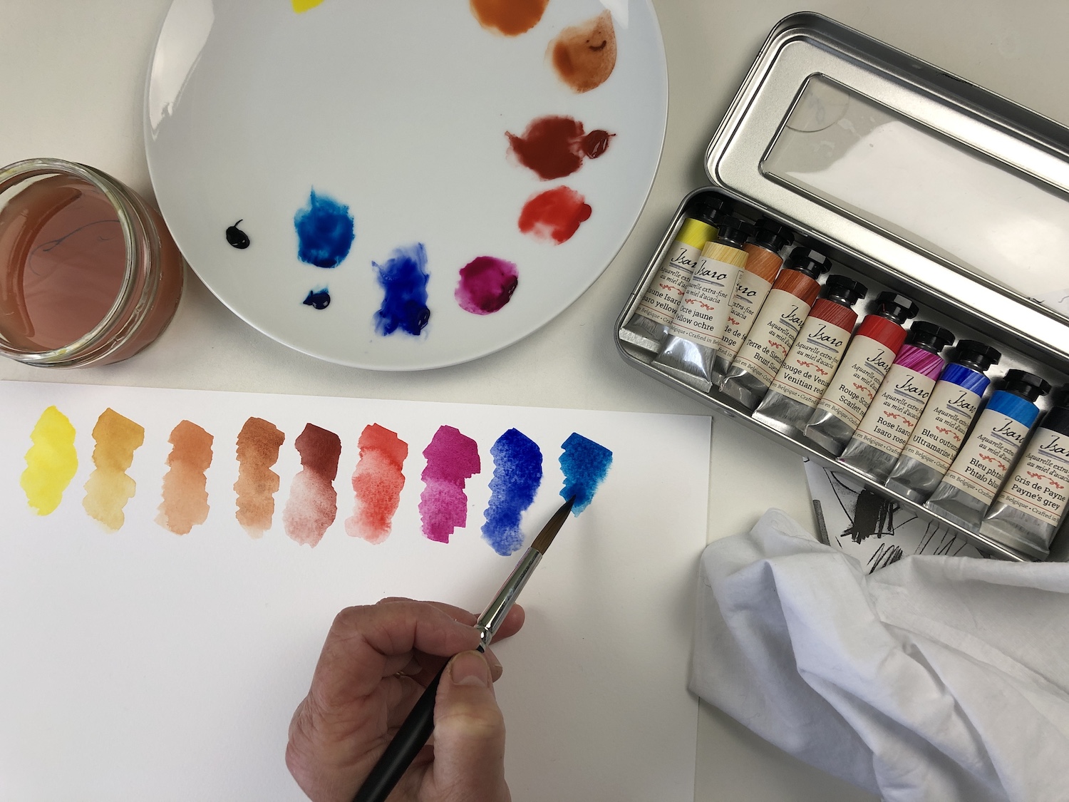
I tend to use a very limited palette, so I was gratified that the set included three colours similar to those I use as primary colours – Phthalo Blue, Rose Isaro and Isaro Yellow Light, I was also pleased to see that all but one (Paynes Grey) are single pigment. Some of the colours are semi-transparent and granulate which don’t work so well for me at the early stages of a painting, as I like to start with wet layers and don’t like the granulating effect, but these colours were ok when applied dry.
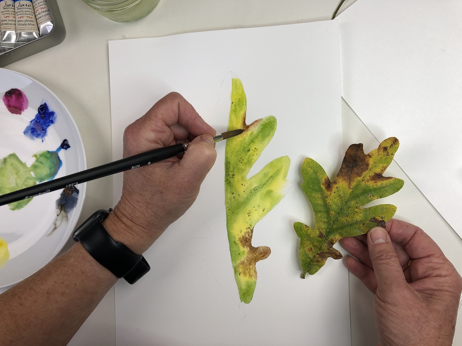
I chose an oak leaf as my subject, inspired by its autumnal colours – yellow, green and brown. I would normally mix my own browns but due to the range of earth colours in the set I didn’t need to spend so long doing this. That said, if I were choosing colours for this set I would substitute one or two of these earth colours with a premixed green and maybe a bright purple.
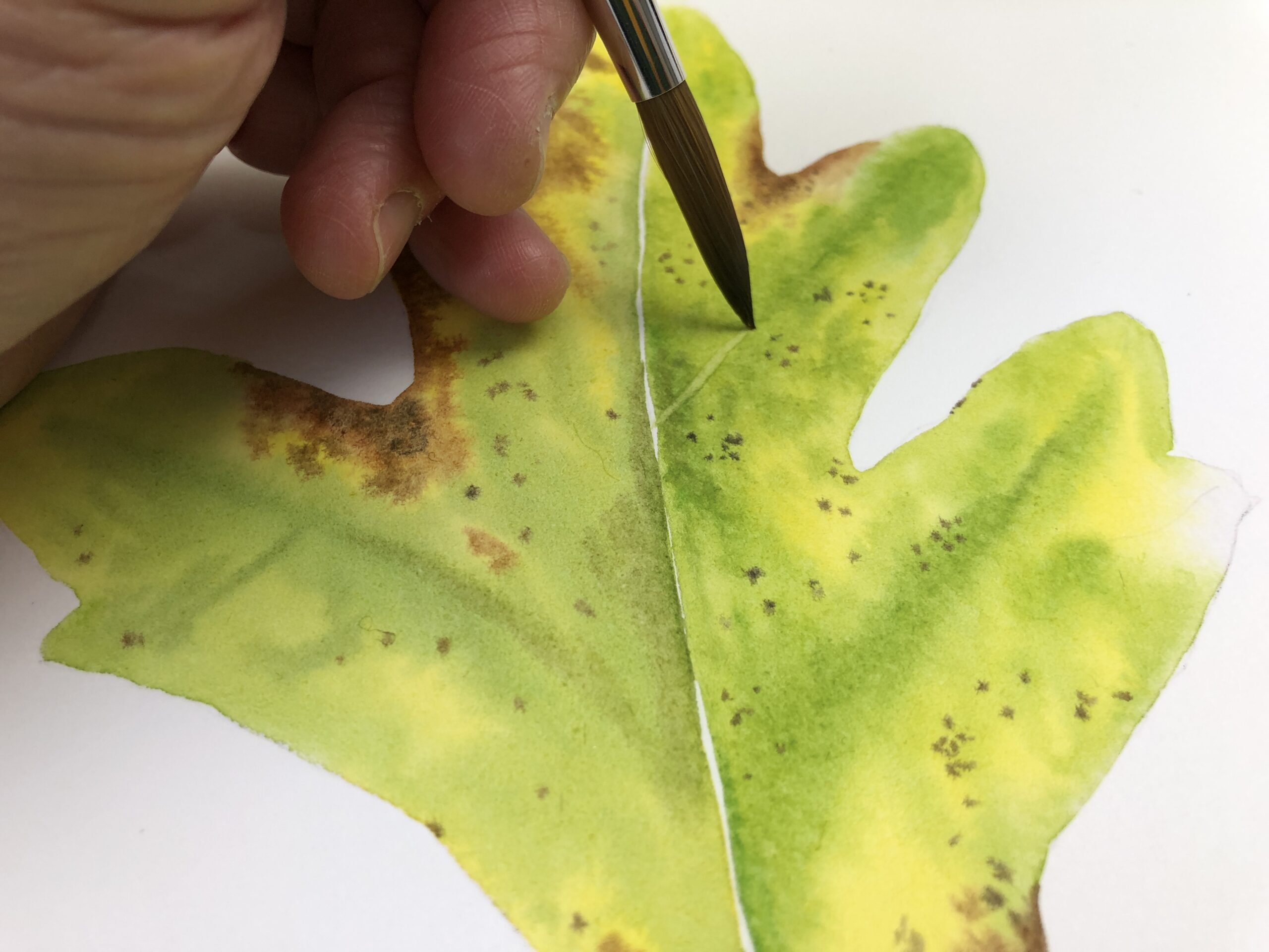
The paper – St Cuthberts Mill Botanical Ultra Smooth Glued Watercolour Pad – has a less absorbent surface than I am used to and I consequently found it rather slippy when applying the initial layers of wet-in-wet. However, the colours stayed bright when dry and I could quickly start adding drier details, without having to repeat the initial layers as I would normally do.
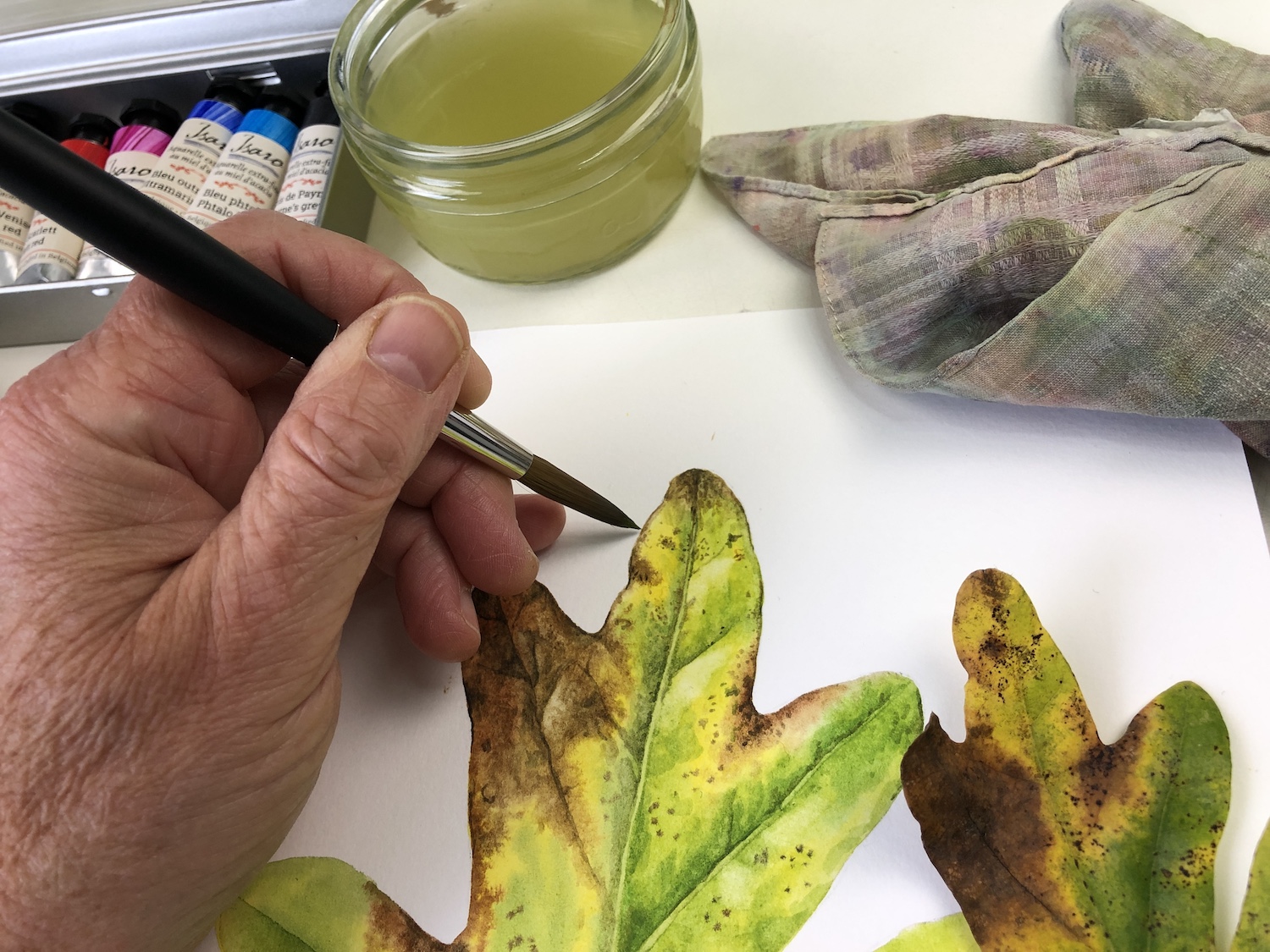
Though the brushes are much larger than botanical artists tend to use, I was determined to see what they could do. Having drawn my leaf out larger than life to fill the A4 paper provided, I used the Jackson’s Raven Synthetic Brush to wet the areas at the start of the project. Given the size of the brush this didn’t take long and, despite its size, I could wet into the smaller lobes of the leaf without issue, as it has a great point. I then swapped to the Jackson’s Kite Synthetic Kolinsky Brush to dab in the colour and then to work on the subsequent detail. I also used this brush to lift out highlights and narrow veins. The nature of the paper meant the paint lifted easily and, though I would normally use a much smaller brush, the tip of the brush was fine enough to add detail without too much issue, on this occasion.

The leaf portrait needs a lot more detail – botanical art is a slow process! And I would need to use this set for a while longer before deciding if I would substitute items for my usual equipment. But it was interesting to put it through its paces.
About Julia Trickey
Julia Trickey has been a botanical artist and tutor for over 20 years. She is particularly interested in capturing fading flowers and autumnal leaves in watercolour, often depicting them larger than life. She has received many awards for her work including four RHS gold medals and has exhibited and taught all around the world. Since the Pandemic she has been regularly hosting fellow botanical artists online, as they talk about their work, projects and passions.
Kit Boyd Tests Jackson’s Curated Sets: Lino Printmaking
This set comes in a stylish branded gift box, immediately giving it a sense of luxury, and useful to keep your tools and inks in if you are an itinerant printmaking soul, or just want to be tidy, unlike me, when you’ve cleaned up at the end of the day.
The set contains:
- Fabriano Medioevalis 260 gsm 20 Blank Cards & Envelopes 17 x 23 cm Deckle Edge
- Cranfield Caligo Safe Wash Relief Ink 75 m x 4, Black, Process Blue (Cyan), Rubine Red, Process Yellow
- Pfeil Linoleum and Block Cutters: L 11/1 x 1, L 5/8 x 1
- Essdee Professional Ink Roller (Black Handle) 5 cm
- Essdee Lino Block 3 mm Softcut 100 x 150 mm x 3
- Japanese Baren for Printing
- Jackson’s Paper Guide
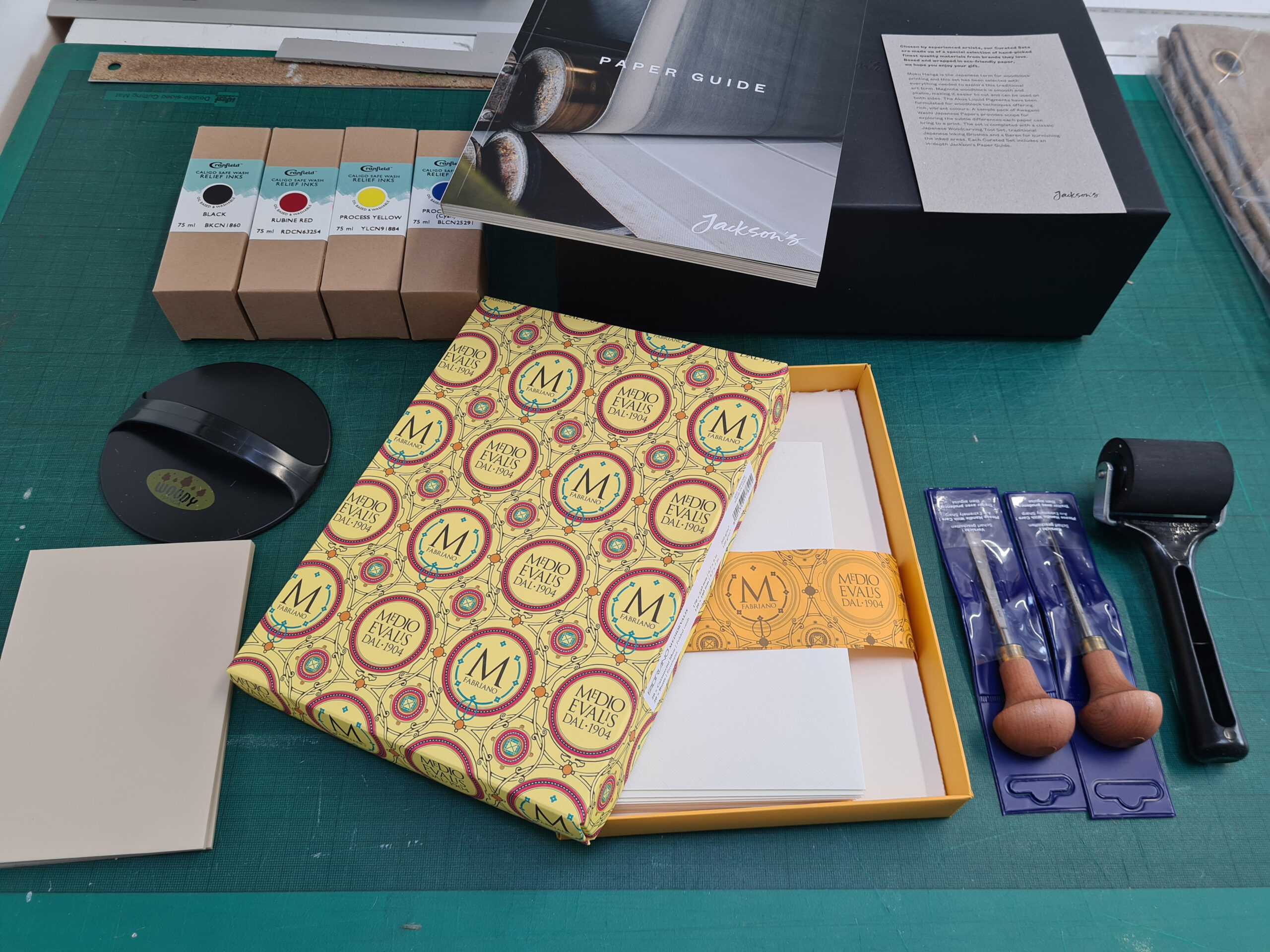
Jackson’s Lino Printmaking Curated Set
Internally the packaging is lovely, making it quite a pleasure to break the seal and unwrap the set to reveal what is inside among the biodegradable foam packaging.
The set comprises 2 Pfeil Linocut tools, always a good choice as they last for years and are so well made. The detail cutter is perfect for the size of the 3 lino sheets enclosed – A6 to print onto the enclosed cards, but the larger clearing tool is just a little too large – I’d only really use a tool of that size on a much larger piece of lino as on these size sheets you are likely to clip a bit of your detailed cutting.
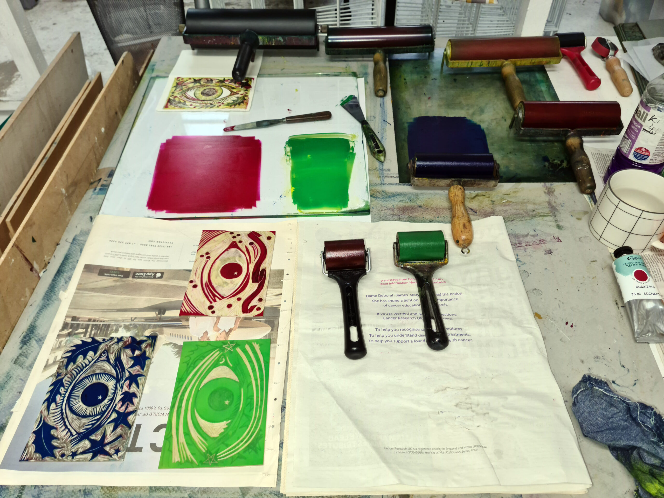
I like the firm Essdee Ink Rollers as they take ink well and provide good coverage when inking the block, though it would have been nicer to have a slightly larger one the width of the plates, so that it would ink the block in one roll across. I used the one supplied with my other rollers when printing this linocut.
It’s the first time I have used these Caligo Washable Relief Inks, which while oil based, can be cleaned with soap and water. The colours are strong and easily mixable. The process yellow and blue produced a very clean bright green.
The black ink takes some time to dry compared to my usual relief inks – the black was still smudge-able 3 days after printing whereas my usual inks tend to need just 24 hours. The coloured inks, even when overprinted, dried more quickly. When printing the red yellow and blue over each other, they produce a strong dark tone.

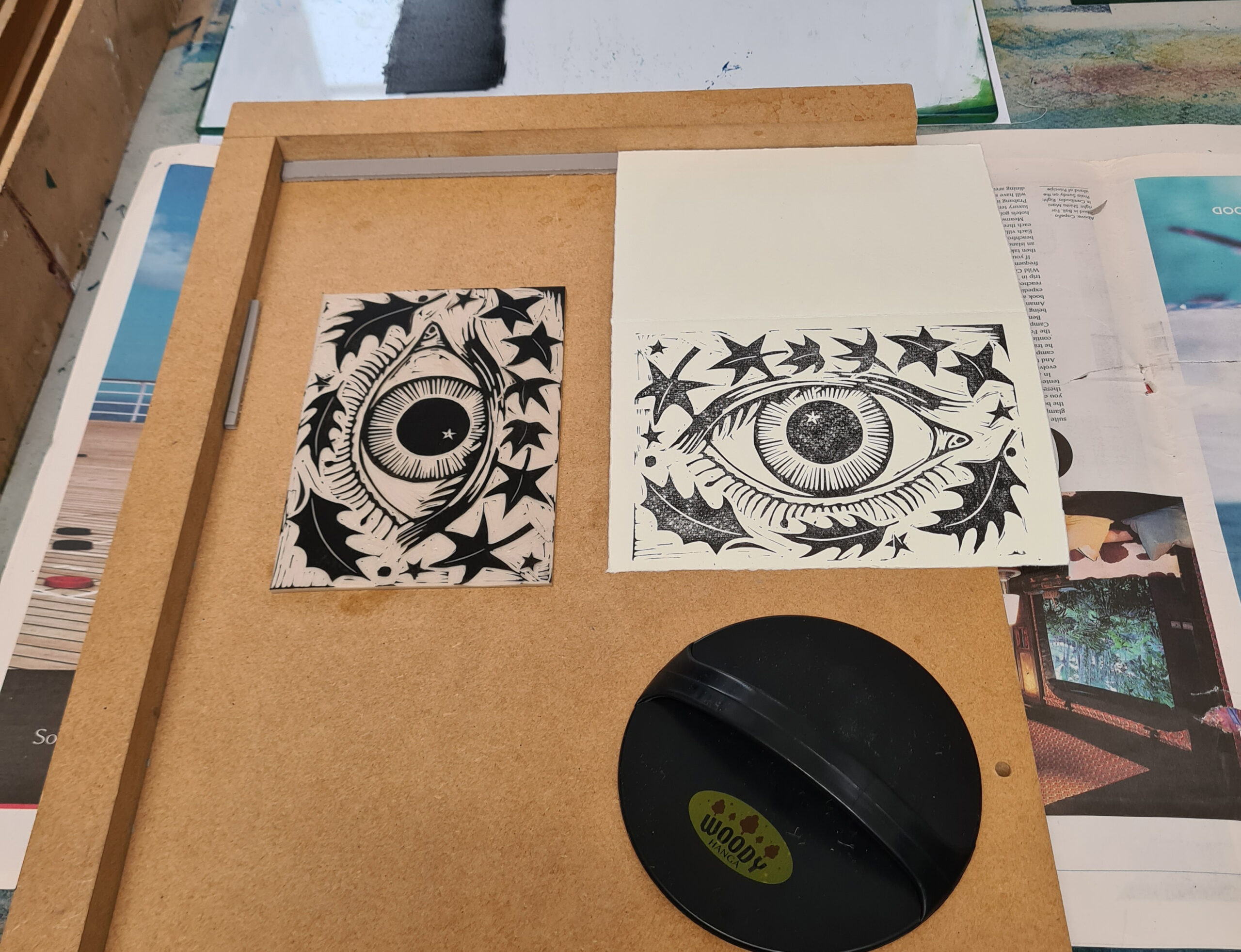
The Fabriano Medioevalis Blank Cards and Envelopes are of a high quality with deckled edges and absorb the ink well, though the textured surface and thickness mean that you have to apply a lot of pressure with the baren to get a good impression to transfer. When I ran the cards through my press, the results were a lot better than with the hand pressed version. The Japanese Baren works very well if printing onto Japanese paper such as Hosho or a smoother Fabriano.
The Essdee Softcut Lino is very soft and is easily cut, but actually the Pfeil tools work far better on a standard firmer lino, and I found they slipped a little on this softer version. My Flexcut Tools with a squarer end seemed to work better on it, but I’d recommend just getting some Essdee Grey Lino to use instead. The Softcut is quite malleable and squashes a little too, under pressure, which means there is a propensity for the ink to spread.

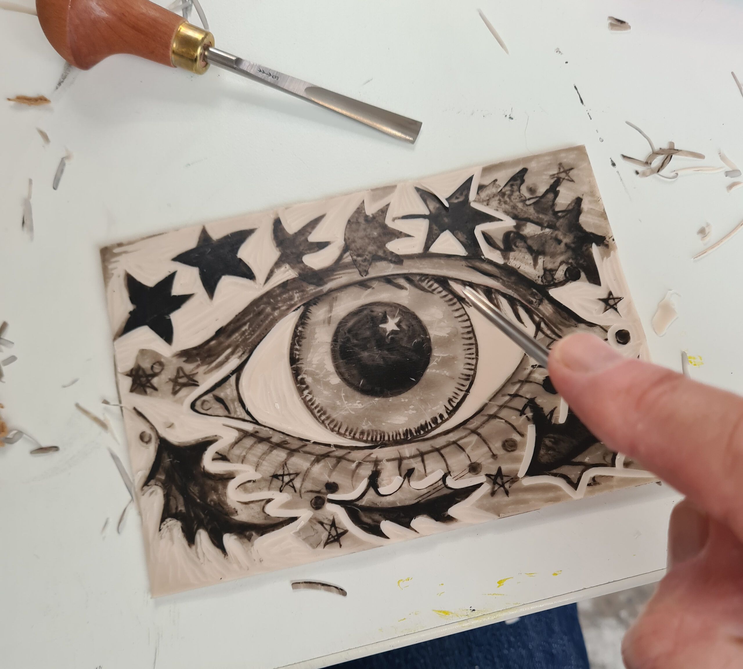
I decided to make a three plate linocut as three were supplied and to use the colours in a pure form, and because I’m reviewing this at the end of November, to theme it around the coming season, so I’ve made a linocut called An Eye for Christmas, which is loosely based on an earlier linocut I made called Eye of the Green Man.
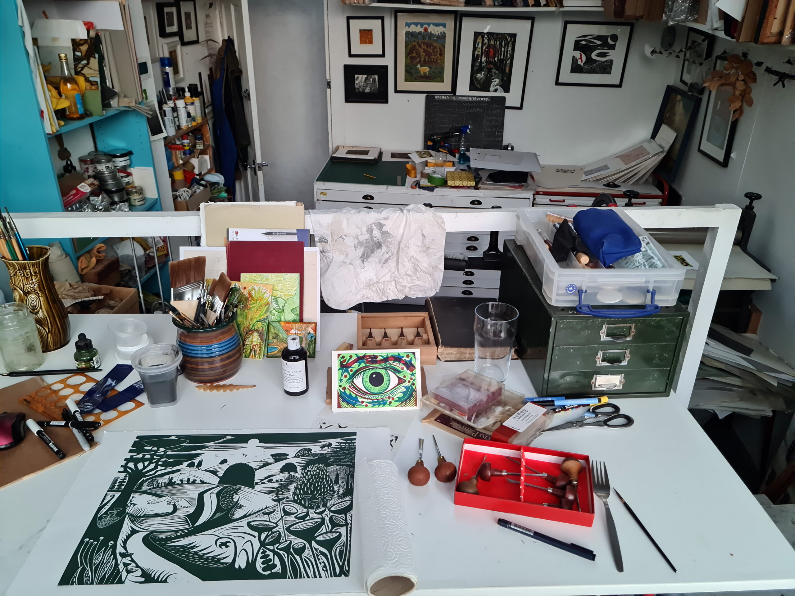
I sketched out my design on one piece of lino before drawing in indian ink and organically building up the design – it’s easier if you have a dark base so that when you cut the lino you can easily see what you have done.
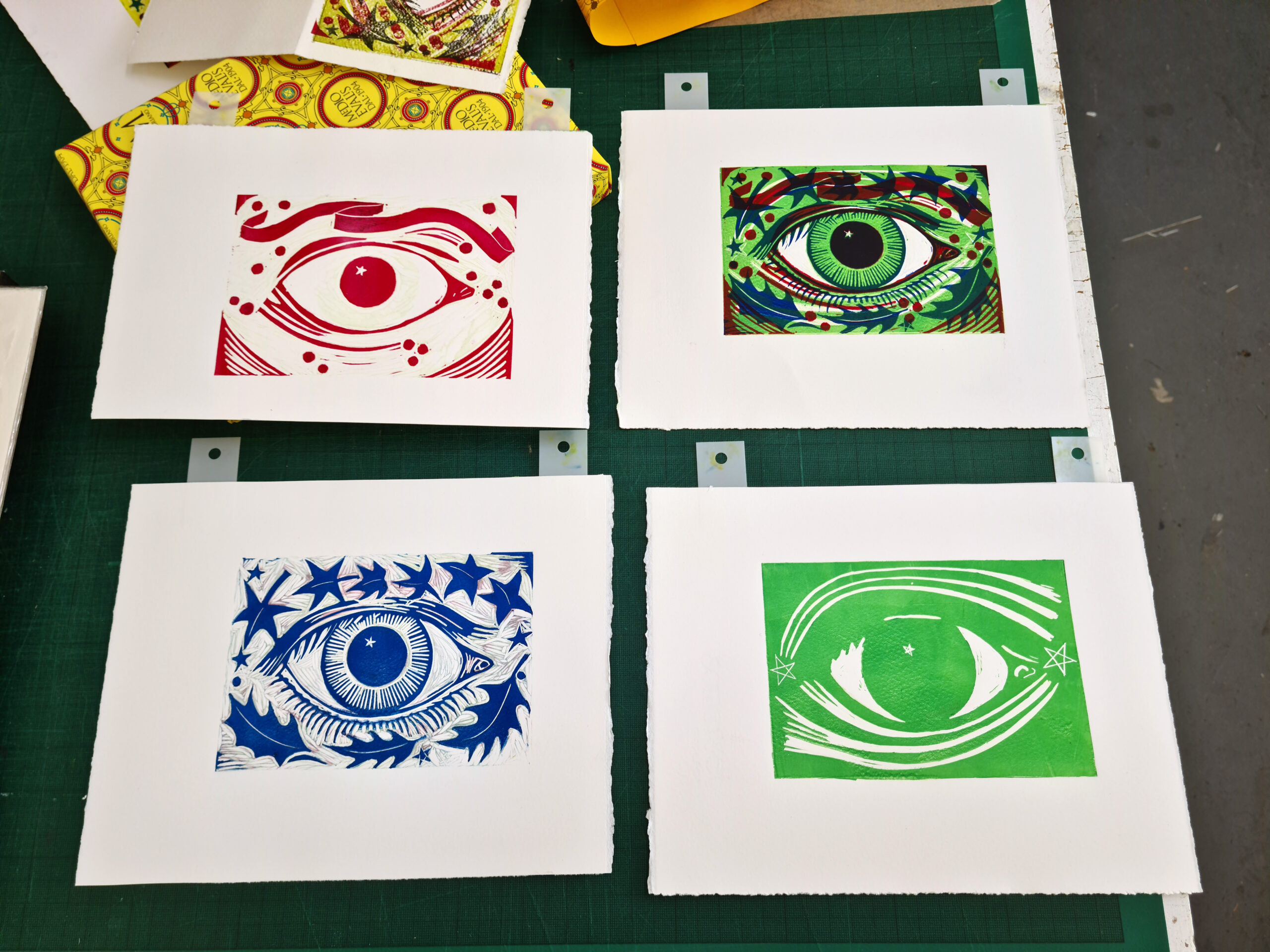
Once cut, I made a card template and printed the key plate in black on one of the cards, and then transferred the image to the two other pieces of lino from the print and let them dry for a few days. These two lino sheets I intended to print in red and yellow and to use a blue for the key plate on top in the final print, rather than use black.
I quite like to wing it a bit when cutting the other layers rather than planning too much, just to have a bit of fun really and to make the process more organic.
For the yellow layer, I cut shooting stars top and bottom and for the red layer added a ribbon and some berries to go with the holly and ivy from the key plate. I’m usually much stricter when I design but felt the need to be more playful here.
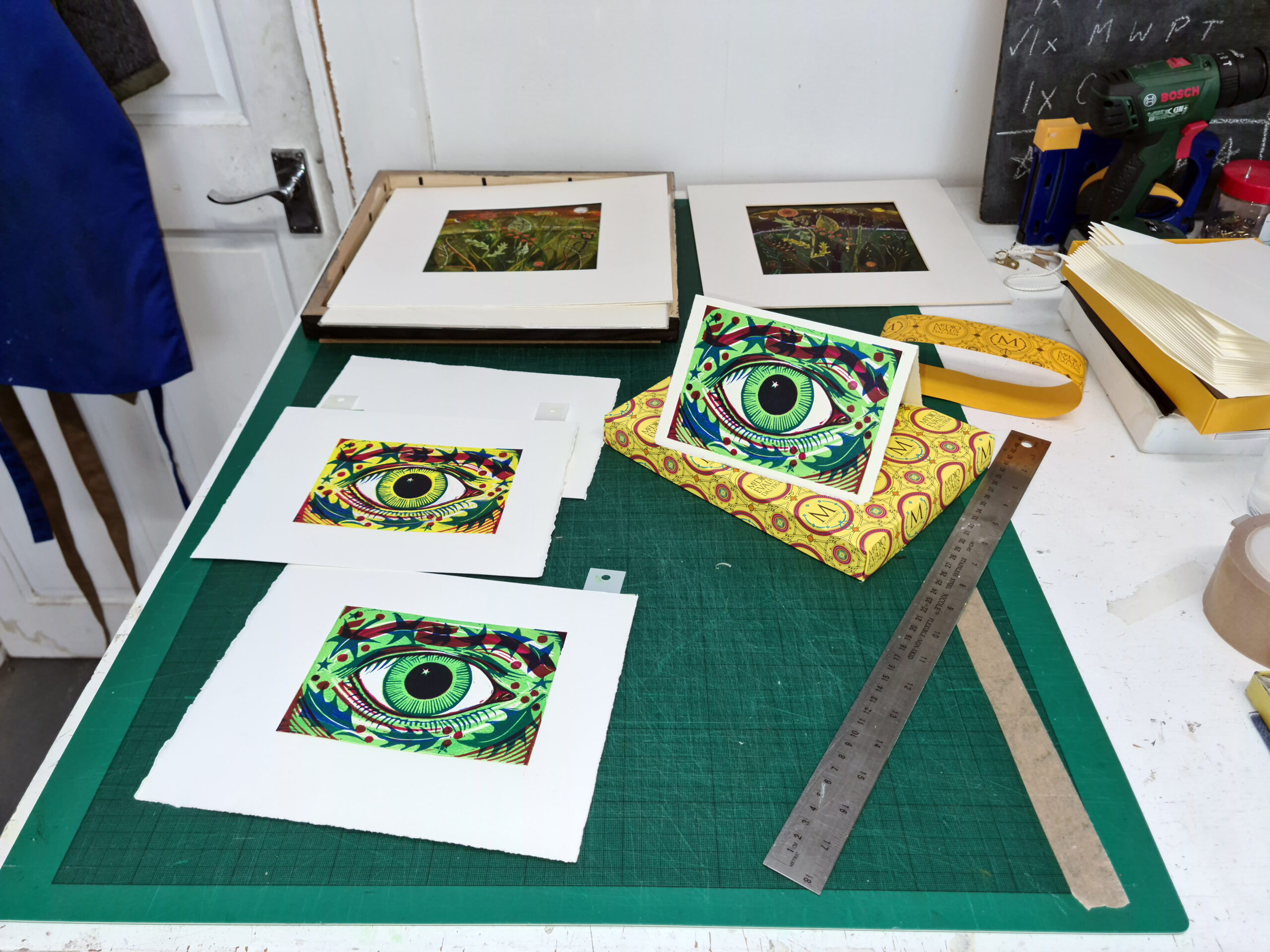
I then inked them all up and printed in sequence – yellow, red, then blue. I printed them initially on Somerset Velvet 300 gsm (my usual printing paper) before I printed onto the cards. I use Ternes Burton Pins to register the prints and ensure that everything will be in the right place, though if you don’t have these you can create a simple template with card or greyboard by cutting out a rectangle for the lino to slot into, and make sure your paper and the lino are in the same place every time you print. You can see my greyboard template here in the photos and all you’d need to do is line up a corner of your paper to a corner of the template each time to ensure your registration.
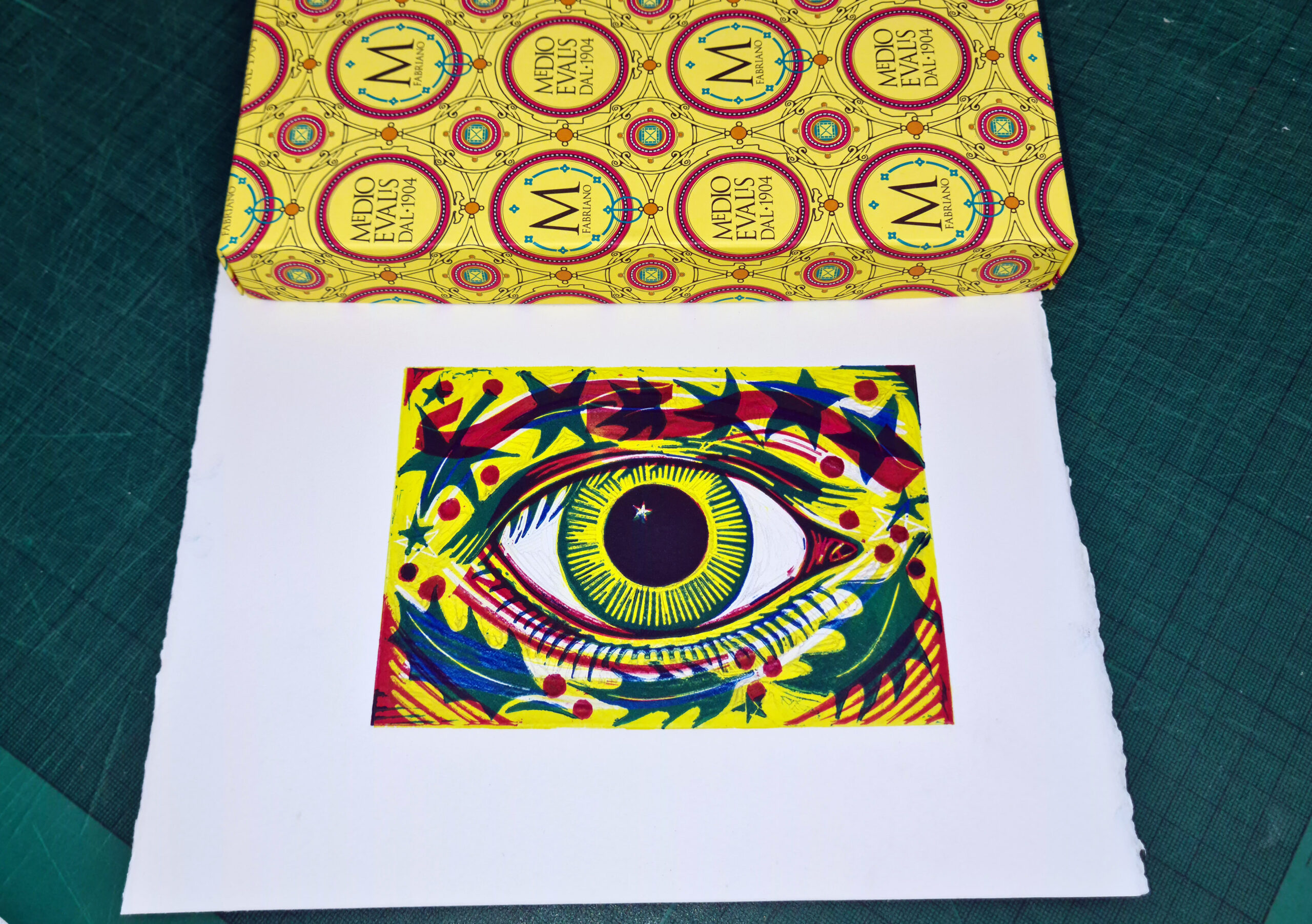
Once the first proof was printed (nicely matching the Fabriano box!) I thought it needed to look more seasonal so I mixed a bright green from the yellow and the blue and printed the first plate in green instead. I think it looks a lot like Christmas now.
It was quite a joy to make something quite quickly and using solely what came in the box, though I did use some of my other clearing lino tools on the soft lino and my extra rollers for the three colours.
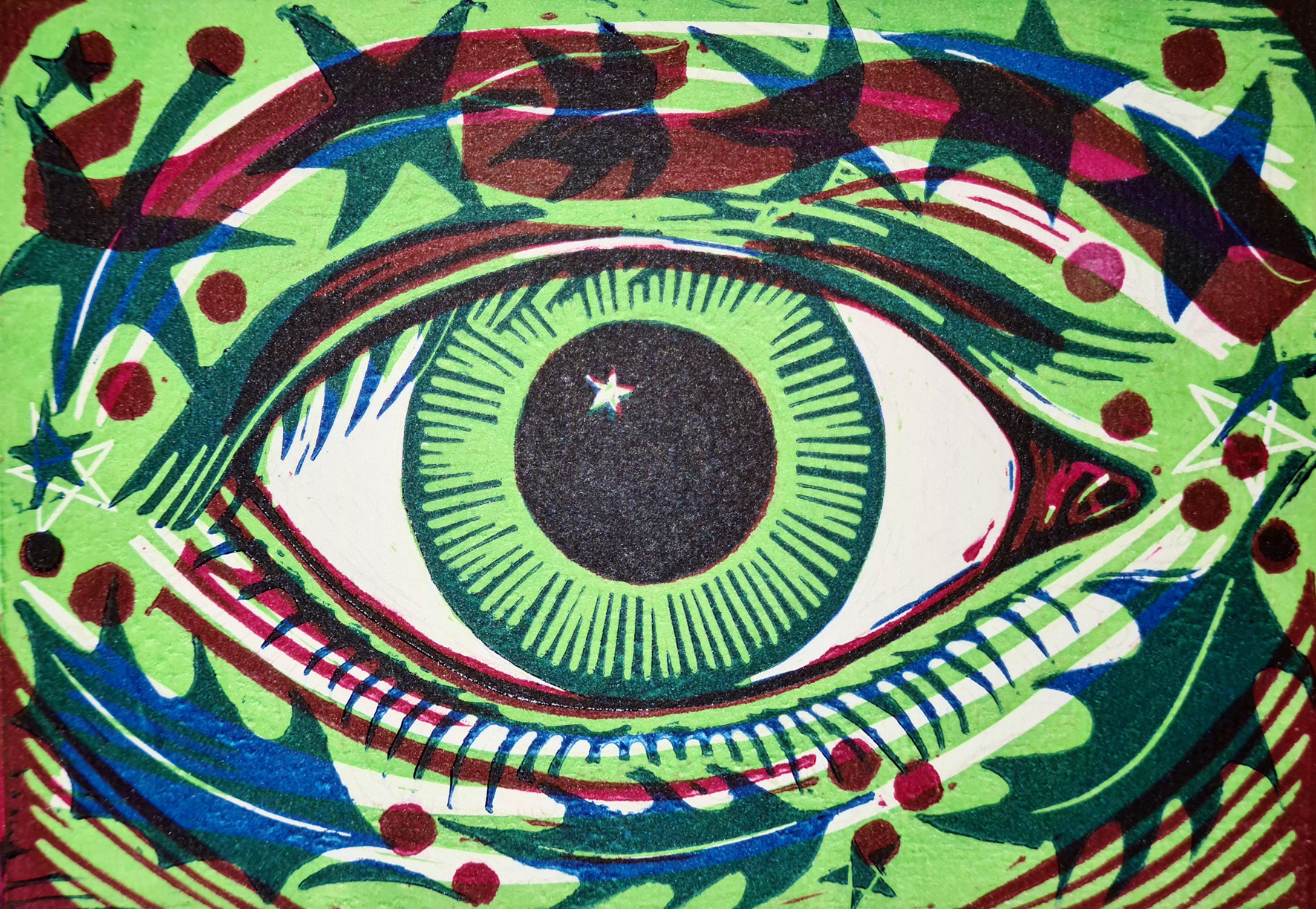
I’d definitely recommend this as a Curated Set for someone to get straight into printing, but perhaps with a side order for some standard Essdee Grey Lino which has more resistance and for me is much more pleasurable to cut. After all, linocutting is all about the pleasure of the process.
About Kit Boyd
Kit Boyd follows in the footsteps of Samuel Palmer and the Neoromantics of the 1940s. Although based in London, his images are often of the countryside or bucolic landscapes from his imagination. He has recently completed commissions for English Heritage and Penguin Random House for the cover of Jean Giono’s The Man Who Planted Trees, and his work often has an environmental message. This year his posters for the Darent Valley Community Rail Partnership in Kent have gone up at 6 stations from Sevenoaks to Swanley, including his homage to Samuel Palmer at Shoreham Station, encouraging people to travel by train.
Ruth Murray Tests Jackson’s Curated Sets: Oil Painting
I am a figurative painter, working mostly with oil paints. I was very pleased to receive a Curated Oil Set from Jackson’s, which consisted of goodies that are similar (but not the same) to items I use.
The set contains:
- Michael Harding Modern Master Set 6 x 40 ml
- Chelsea Classical Studio Clarified Extra Pale Cold Pressed Linseed Oil
- Two Belle Arti Canvas Panels
- Jackson’s Extra Offset Crank Painting Knife
- Four Jackson’s Black Hog Bristle Brushes
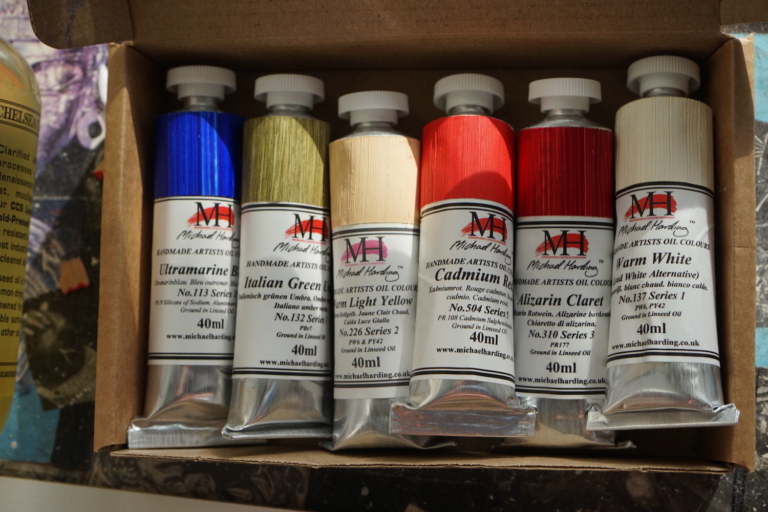
My preferred brand of oil paint is Michael Harding, after trying various brands over the years I have become quite loyal to it. Michael Harding is a UK brand that is favoured by lots of my painter friends too. They have a great range of colours and consistently have the perfect buttery texture.
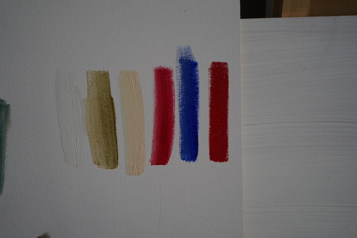
The six colours I received were: Ultramarine Blue, Warm White, Italian Green Umber (all Series 1), Warm Light Yellow (Series 2), Alizarin Claret (Series 3) and Cadmium Red, which is a Series 5 colour – a real treat! The paints get more expensive the higher the Series number, and I usually only let myself buy up to Series 3.
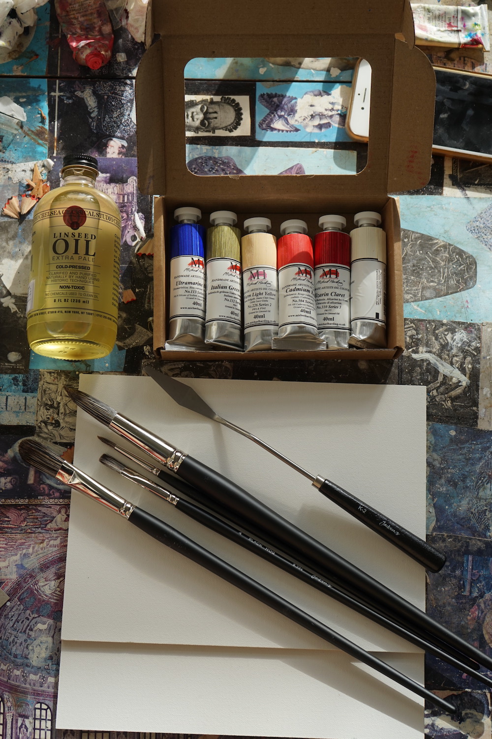
It’s an interesting set of colours, I like to arrange my palette in a sort of rainbow, with a little bit of lots of different colours. I’ve slipped these new colours into my usual palette, Alizarin Claret sits nicely between two other paints I like – Crimson Lake and Quinacridone Rose. I find reds useful for making darker colours, particularly when mixed with greens and blues.
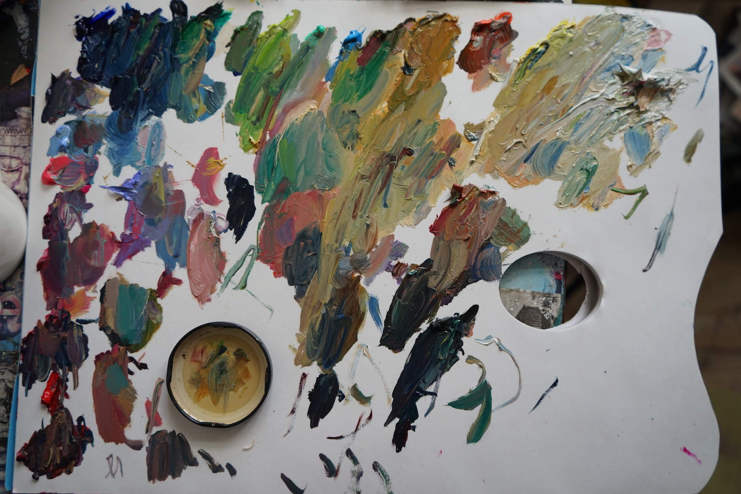
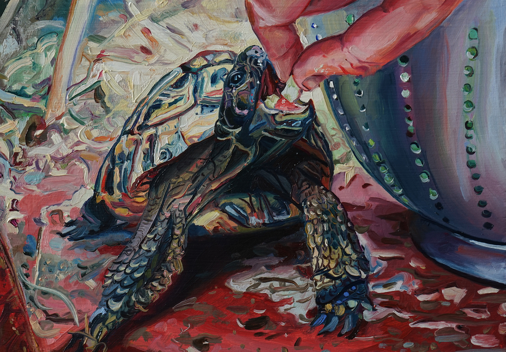
The canvas panels have a lovely smooth finish with no imperfections, they are pre-primed so you can paint on them directly without any preparation. I always work with a source image, and today I’ve chosen an image of my friend’s tortoises… very intriguing creatures and lots of Italian green umber in there!
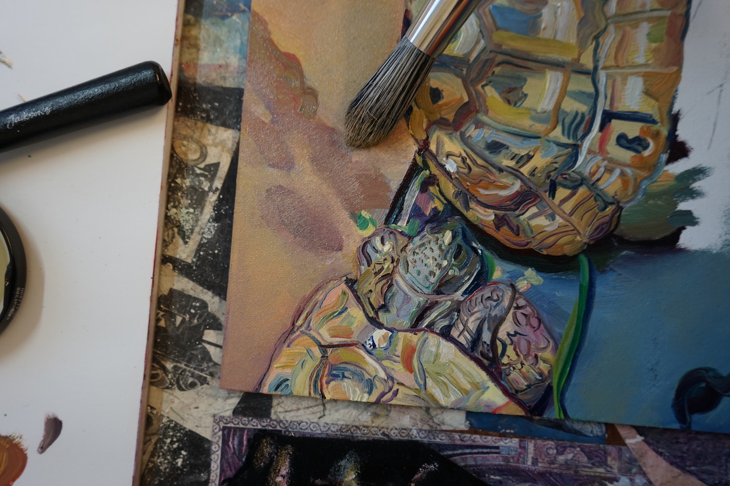
The texture of all the paints is as I’d hoped, it glides on easily, not too oily or dry. The colour of the paints are really strong, and a little bit goes a long way so you can mix new colours with just a bit of paint. They are lovely paints to work with. The Italian Green Umber and the Alizarin Claret have a nice transparency when applied thinly too.
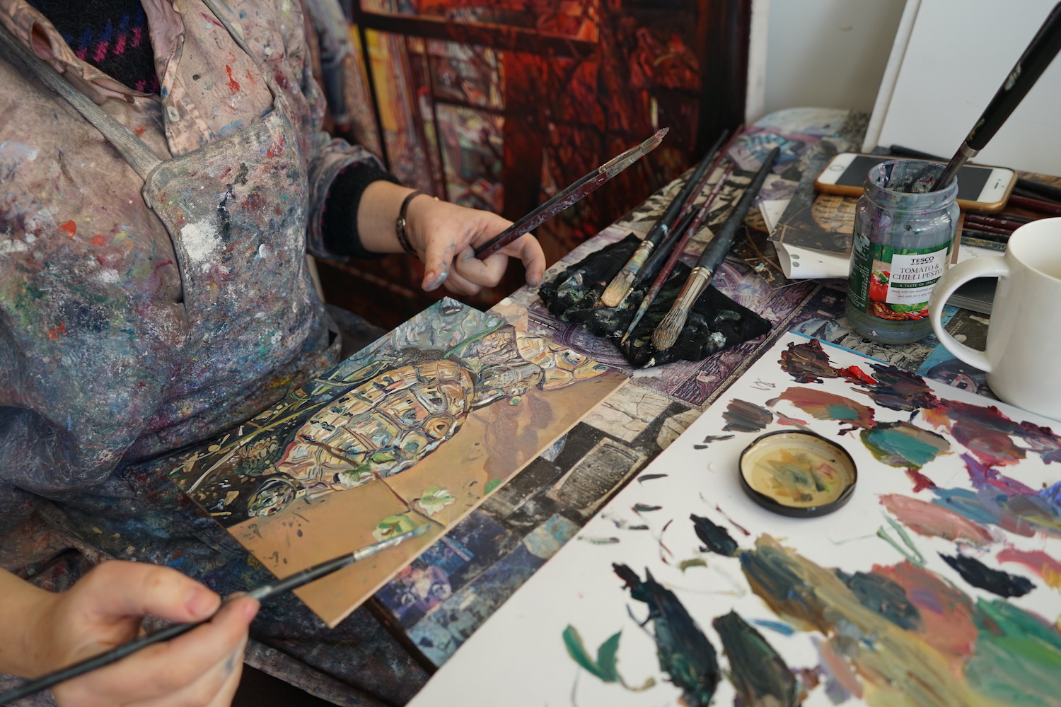
I am using the hog brushes and a little cold pressed linseed oil when I want to make the paint nice and slippery. On a small scale like this I usually work on primed, wooden panels so in contrast the canvas is fairly absorbent. Using the big round tipped brushes you can create a nice softness, and flatten any marks. I start with the bigger brushes, to block in base colours and then work over this.
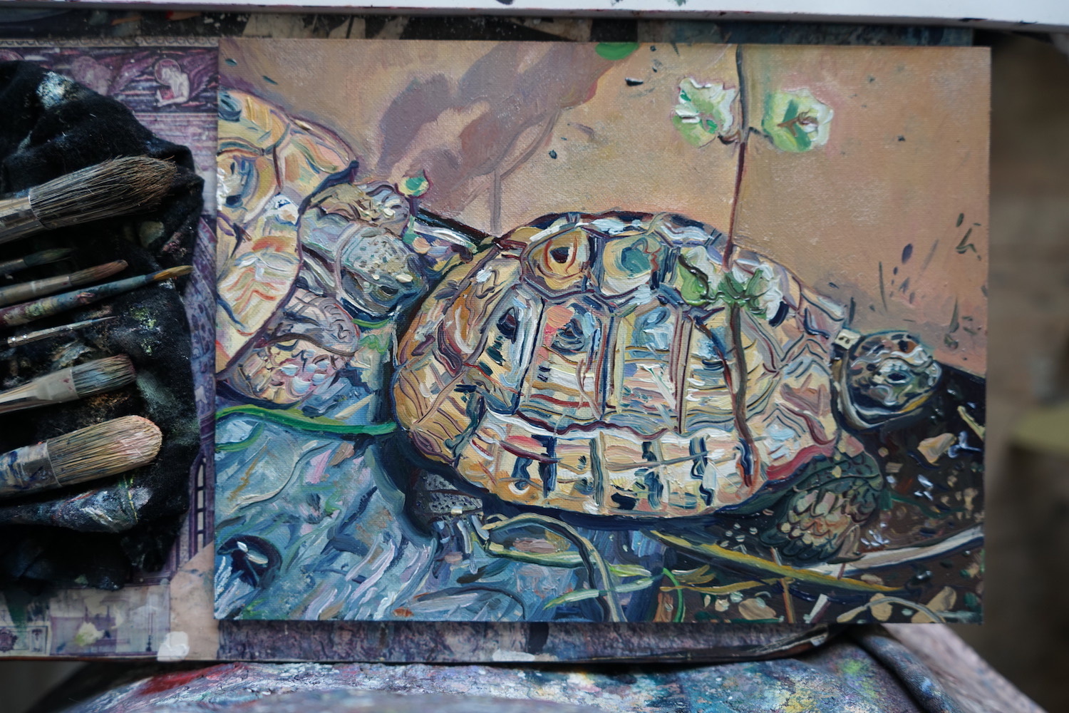
The hog brushes are synthetic so softer than real hog hair brushes, which can sometimes leave scratchy marks. They seem nice and robust, holding their shape pretty well and not shedding any bristles. I do still find them a bit scratchy for my taste, I prefer real hair brushes such as black sable. They are softer, but do deteriorate after a few paintings. These will be useful to have in my tool box and I imagine will last a bit longer.
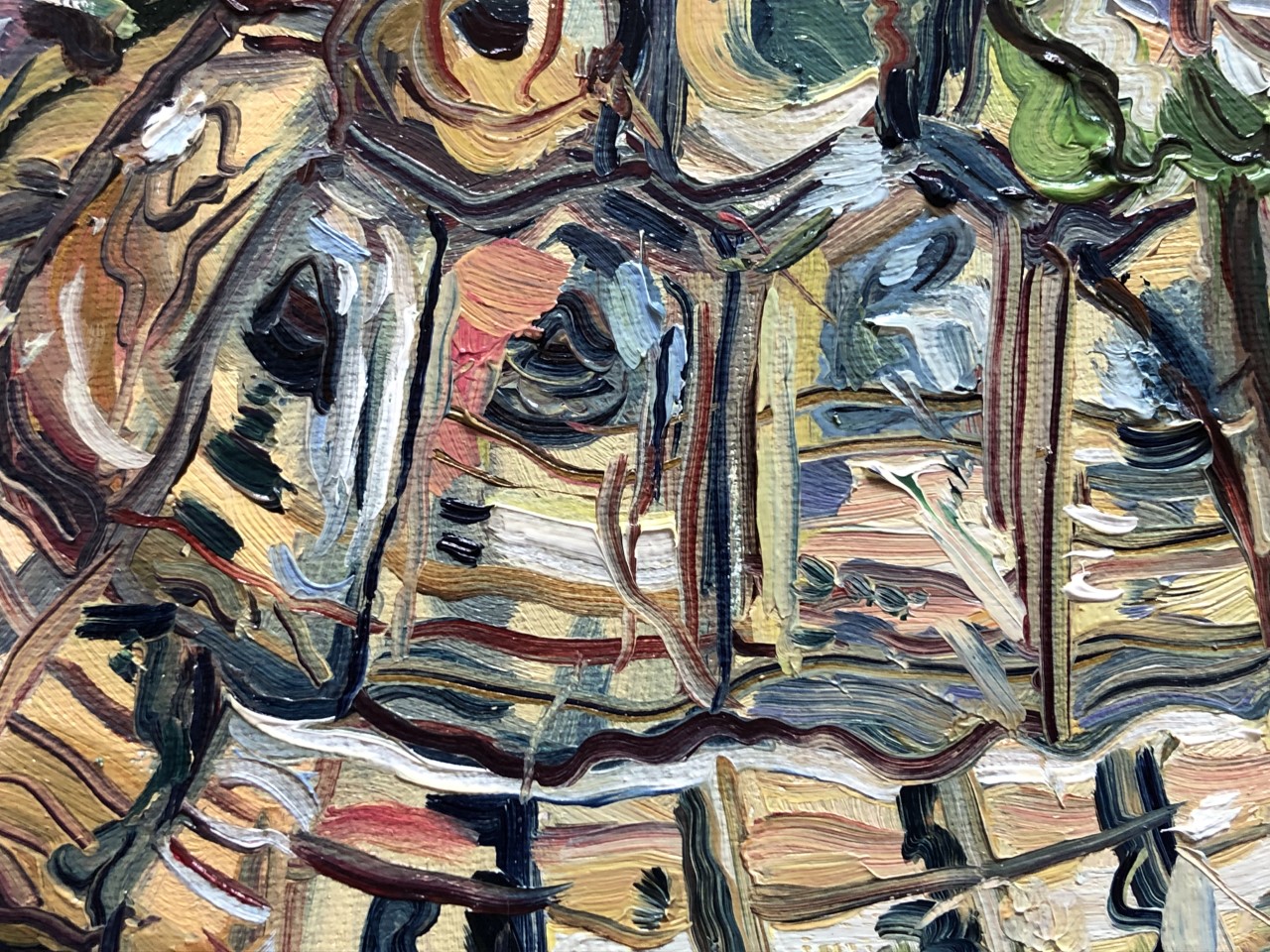
I don’t do a lot of sketching but these small scale paintings sometimes function that way for me. To work through ideas quickly before making larger work. This tortoise painting is now one of three similar paintings. I used the palette knife a little too, but will definitely use it more when painting in a more impasto style.
About Ruth Murray
Ruth Murray is a Manchester-based artist whose work reflects a deep interest in exploring portraiture, identity, and the presence of human concerns in natural settings and the social landscape.
Ruth graduated from the Royal College of Art and was the Derek Hill Scholar at the British School at Rome in 2008. Her notable exhibitions include Northern Stars at the A Foundation, Saatchi’s 4 New Sensations, The Creative Cities Collection at the Barbican and the BP Portrait Award at the National Portrait Gallery. She was awarded an Elizabeth Greenshields grant in 2021, she won the Jackson’s Painting Prize in 2020 and she was shortlisted for the Contemporary British Painting Prize in 2019.
Further Reading
Oil Painting for Beginners: What You Need to Get Started
Linocut Printmaking for Beginners – What You Need to Get Started
Art Terms Explained: Watercolour Painting
A Guide to Watercolour Painting
Shop Jackson’s Curated Sets on jacksonsart.com


:strip_icc()/BHG_PTSN19720-33d9cd22f6ab49e6a21982e451321898.jpg)

More Stories
BSA Film Friday: 11.25.22 | Brooklyn Street Art
FEATURES – Art in VR with Casey Koyczan
Julie Karpodini: Painting Instinct – Jackson’s Art Blog